MY FIRST HOMEFRONT SIG

XGC xBUSTAx

New member
i was playing around with it so decided to pop it in here and see what you all think?


Please rate this 1/10



HOMEFRONT.jpg
 
Last edited:

XGC xBUSTAx

New member
hmmm... just now noticed that!

need to fix the right top side of the guys head... seems the white maybe lil to much..maybe color some red into it more
 

KoG Sherman

New member
everyone gave you nice reviews so im just gonna be the really mean guy here. dont hate me haha

5/10

1. the grid on the left is nice it should have been cotinued on the right or been faded out instead of disapeering. -

2.there is no flow in the sig whatsoever. -

3. theres a white spot on his head from light, you should put some light around there.. -

4.the focal does not blend into the background looks like he was copy and pasted on top, try gradient maps. -

5. same for the "HOMEFRONT" in the BG, sticks out, try gradiant maps. -

6. never just use the head of a focal, (though in your favor there arent many homefront renders out there so theres not much of a choice for ya.) /

7. the black and white BG behide everything else looks nice. +

8. good job at cutting the focal and text +
 

TRu GALIA

New member
Alright I'm gonna agree with Sherman, and give you a 4/10.

- My biggest problem has to be the HomeFront name. Where is the whole thing??? (HOM ONT)

- Next I feel like there is just a huge color overpower-age. It kinda looks like a blob when you glance at it.

- Definitely agree on the focal point, fix it lol

- I like the right side of your sig more than the left ;)

 

XGC xBUSTAx

New member
everyone gave you nice reviews so im just gonna be the really mean guy here. dont hate me haha

5/10

1. the grid on the left is nice it should have been cotinued on the right or been faded out instead of disapeering. -

2.there is no flow in the sig whatsoever. -

3. theres a white spot on his head from light, you should put some light around there.. -

4.the focal does not blend into the background looks like he was copy and pasted on top, try gradient maps. -

5. same for the "HOMEFRONT" in the BG, sticks out, try gradiant maps. -

6. never just use the head of a focal, (though in your favor there arent many homefront renders out there so theres not much of a choice for ya.) /

7. the black and white BG behide everything else looks nice. +

8. good job at cutting the focal and text +


1. i didnt want the grid to be the same on both sides....kinda the deal between HOME then have it blend in with FRONT

2. im not sure what you mean by "flow"?

3. i was actually going to do a fill-in with red to have the rag finish around that side of his head.

4. i didnt want to blur,or blend it together, i actually was trying to make it like a pop-out...something like that (3D'ish)

5. same as answer 4 =/

6. lol, thats my point.. i looked all over for them and thats all i found =( give it time... not sure if anyone has made a HOMEFRONT sig in XG yet???? (besides me)

7. ....thanks

8. lol, was a pain... i actually like the BG with the city up in flames and smoke but was not sure what i could do with that less i found a pic from homefront but i didnt find many pics since the game is Farly new and all.


ps. thanks for the rate =) its also been over 3 years since i last did this stuff
 

XGC xBUSTAx

New member
Alright I'm gonna agree with Sherman, and give you a 4/10.

- My biggest problem has to be the HomeFront name. Where is the whole thing??? (HOM ONT)

- Next I feel like there is just a huge color overpower-age. It kinda looks like a blob when you glance at it.

- Definitely agree on the focal point, fix it lol

- I like the right side of your sig more than the left ;)


1. lol well i and im sure others think its pretty cool like that, besides most gamers would obviously know what that means! i it was a debate to have it a little smaller then have it infront instead of behind but i wanted the guy to stick out more.

2. color overpower-age? blob? not sure what you mean..please explain more details on what you mean please?

3. ...i can fix you! ;)

4. lol, i was thinking the same thing
 

KoG Sherman

New member
flow means the everything sort of goes in one direction, not everything going everywhere.

you dont need to blend it all together but if you just made the colors the same it would be much nicer. just put anygradiant map you have on top of it and stick it on soft light, then maybe lower the opacity if you want to, make it look so much better

KoG-Mufasa.png


made that a LONG LONG time ago, i hate it, but it is a homefront sig
 

XDC Jinno

New member
-5/10

-planetrenders.net has the render perfectly freshly made out for you

-so goes for the 'homefront'. planetrenders.net

-bit of a messy background. sherman said flow.

-your signature will look bad if your image(render or in this case, the guy) or focal quality is bad.

-(in my opinion) keep signatures simple and it will just come out fine.

-gradient maps makes the signature better. so use em

-you can have that 3-D effect with gradient maps too.

This is an example without a gradientmap (using gimp):

Jokerwithoutgradient.png


With gradientmap: (with gimp still) and its a very big difference.
XGCbabyjoker.png


I used gradient maps on this and still maintained a "3-d" effect

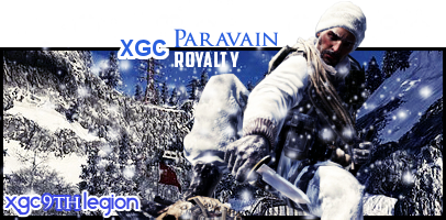
Xgcroyalty3.png


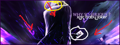
Redlines-flow
Yellow circle-lightsource
whitecircle- where the flow is trying to aim at
jokeradjustments.png


Although joker is the focal im trying to aim at the card by using flow.
 

MissSilverFyre

New member
In GIMP if you go to Color -> Maps -> and select Gradient maps, you will achieve a gradient effect. Make sure you Make a new layer and view visible BEFORE you use this effect. Click on the gradients image in your list and choose which gradient you want. I tend to like the French Flag smooth, set to Soft light with a 10% opacity level. It gives the picture an almost vintage type look. And it should help your image pop out more. :) Just because you are blending an image to the background, doesn't mean you are losing the 3D effect you are looking for. :D If you need help with GIMP, I use it and I can help you out the best I can. There are many tutorials that I have found/ have been shown and I can share them with you if you'd like.
 

XGC xBUSTAx

New member
ok sooo i did an update to this.. did what most of you said i needed to do and this is what i came up with =/


HOMEFRONTupdate1.png


better? yes/no????
 

XGC xBUSTAx

New member
i think i should have gone with a darker red then that. but this is just to see if i am getting it right on what most of you said i should try doing... =/


FYI: im still trying to refresh myself with gimp, have not touched it since 2006 =/
 

XDC Jinno

New member
yeah i know your just refreshing and i think its great your taking the time to redo these.

I say start off from scratch again. because the render's for both homefront can be found in planetrenders.net

the background needs to be something different. because you got one thing going and another one going again.

if you dont know how to use gradient maps make a signature and post it ill try my best to recite what to do
 

XGC xBUSTAx

New member
ok thats sounds good

i will start from scratch and get the renders from planetrenders.com

then do it again...then post it.

maybe some one can copy there screen on gradient maps step by step to show me?
 
Top