You are using an out of date browser. It may not display this or other websites correctly.
You should upgrade or use an alternative browser.
You should upgrade or use an alternative browser.
OLD GALLERY PAGES
- Thread starter sturmklient
- Start date
- Status
- Not open for further replies.
georgeholland1
New member
ROLL UP, ROLL UP!
Roll up, roll up!
.. in a nice bugatti!
hey guys and girls, ive been away for a couple of days trying to sort some things out, but never fear im here
and since i have not contributed towards the gallery since then i thought i would do so with this:
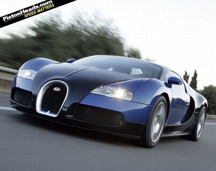
Stock:

Result:

i know the text isnt right there but it will change if someone wants to use it...
C+C please
Roll up, roll up!
.. in a nice bugatti!
hey guys and girls, ive been away for a couple of days trying to sort some things out, but never fear im here
and since i have not contributed towards the gallery since then i thought i would do so with this:
Stock:

Result:

i know the text isnt right there but it will change if someone wants to use it...
C+C please
not too bad
not too fond of the gradient...i would go 4 something.....more realistic, try to keep car color as real as possible instead of throwing in the gradinet virtually unmodified
correct me if im wrong.....just applied image then blue/yellow gradient?
if so id try just setting the gradient on a lower opacity, so the gradient would just accent the tag
georgeholland1
New member
believe me, the difference between the gradient and the car colour are minimal.
oh and wrong, there are 2 gradient maps, both with a gradient from right to left and vice versa. and erased bits with a soft eraser with opacity set to 35%.
i did this to try and set a look to it:
From left to right- old skool, vintage type of feel, then futuristic/modern
oh and wrong, there are 2 gradient maps, both with a gradient from right to left and vice versa. and erased bits with a soft eraser with opacity set to 35%.
i did this to try and set a look to it:
From left to right- old skool, vintage type of feel, then futuristic/modern
XGC Chocobo
New member
All together I love the transformation. However, I'm not fond of the grain I'm seeing in some parts of the background, or that golden gradient.
It's a very sleek car and sig, and the grain just doesn't go. The car is also very silvery. I would've stayed in a blue/greycale area... or used a color balance to turn the car green.
One last thing I think could be improved is the preserving of the lights from the original picture. I think the muting of them makes the whole sig look "foggy".
georgeholland1
New member
xtor- no, i used gradient maps, but in those gradient maps you can brush/erase, do anything in the mask it provides in cs3, and i used a gradient in the mask of the gradient map... lol confusing i know 
choc- the grain can be sorted no problem. and ill try and preserve the lights
ill make up another one with all of the suggestions and post it in a few hours as i have football (soccer )
)
choc- the grain can be sorted no problem. and ill try and preserve the lights
ill make up another one with all of the suggestions and post it in a few hours as i have football (soccer
georgeholland1
New member
here is one in the mean time however:
render:

result:

before you say it is too simple in design, please remember it is a cartoon render, and i kept it in a cartoon style. and also notice the shading on the render
render:

result:

before you say it is too simple in design, please remember it is a cartoon render, and i kept it in a cartoon style. and also notice the shading on the render
georgeholland1
New member
heres the second attempt guys!

that better?
i tried the car green and it just didnt look right with the blue i had and greyscale you cant tell its green lol

that better?
i tried the car green and it just didnt look right with the blue i had and greyscale you cant tell its green lol
SYN Cheddarbob
New member
It's a little too bright on the right side, but it still looks nice
georgeholland1
New member

better?
georgeholland1
New member
WHO IS VICTOR?
who is victor?
this is my first attempt at a vector guys and girls!
stock:

vector:

this took an hour and a half and is no where as detailed as it could be
2nd stock:

the vector is too rough to show here .
.
the sig:
after 3 and a half hours trying to get this complete, all from scratch... its finally finished!
i am going for an old skool car racing game.. well thats the theme idea anyway. decide for yourself!

who is victor?
this is my first attempt at a vector guys and girls!
stock:

vector:

this took an hour and a half and is no where as detailed as it could be
2nd stock:

the vector is too rough to show here
the sig:
after 3 and a half hours trying to get this complete, all from scratch... its finally finished!
i am going for an old skool car racing game.. well thats the theme idea anyway. decide for yourself!

georgeholland1
New member
you can always challenge someone trickst3r
xtor- very specific
xtor- very specific
SYN Cheddarbob
New member
I'll pick when I have some free time haha
- Status
- Not open for further replies.
