OLD GALLERY PAGES

OLD GALLERY PAGES


  • Total voters
    12
Status
Not open for further replies.

MasterLeaf

New member
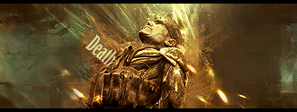
Heres my two most recent tags
thought id post em up for you XGers to take a look at

CnC?

also, anyone up for a sig battle?

Angelic.

Angelic.png


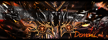
Demonic.
Demonic.png

Your sigs are usually awesome. The Angelic one is, but the demonic one...I looked it over and over again before i realized there was someone in the middle.

Too much noise in the bg and the render blends too well.

my 2 cents.
 

Snowblind

New member
HIGH LIFE SHIRT DESIGN

High Life Shirt Design

A Halo 3 team that I coached in Orlando needed a shirt designed for their team because they are going to a event in Dallas next month. This is my frist time ever doing a real shirt design, all of my other ones are horrible and I would never even consider putting them in my portfolio. This design is definetly making it into my portfolio though.

Sorry about the huge size, I am to lazy to crop it.

Frontcharcoal.gif


So what do you all think?
 

KEVO241

New member
same man u are better than me i have this sertian sryle i cant get out of my head and its getting the better of me i need to make some like yours man realy realy realy good i could sit here and keep typing realy over and over but dont have time lol but nice work man.
 

Benners5

New member
You know I never thought of that, I really needed that sarcastic comment to steer me in the right direction. I was just making a request to the author for future reference.
 

Spoongem

New member
XGC BAAL! BUT EVERYONE'S INVITED TO BATTLE!

XGC Baal! But everyone's Invited To battle!

Anybody wana do this? im so bored......
but I particularly want to battle XGC baal.
But everybody's invited...
Baal can pick the render
No specific dimensions....
and you can pick the when they have to be done.....
Im just trying to have sum fun here guys!
 

XGC Chocobo

New member
Wow, those are really nice. I love the blending, and what you did with the text in the death sig.

My only suggestion is changing the angle of your motion blurs to fit your renders. In the first one, the motion blur looks like it's on an angle of "0", while the render is tilting, makes the movement look...off.
 

Ares32

New member
Wow, those are really nice. I love the blending, and what you did with the text in the death sig.

My only suggestion is changing the angle of your motion blurs to fit your renders. In the first one, the motion blur looks like it's on an angle of "0", while the render is tilting, makes the movement look...off.

Thats not a motion blur, its Wind.
 
Status
Not open for further replies.
Top