OLD GALLERY PAGES

OLD GALLERY PAGES


  • Total voters
    12
Status
Not open for further replies.

XGC Rare FX

New member
Well one thing i would do with almost all of your sig is fix the contrast on them the lighting looks way to harsh on a lot of them also i would work with the effects on them some of them look to messy because you add too many effects and other the effects are kinda boring but i would use some more tutorials to try to get better

Im going to have to dissagree (no offence of course). If anything, alot of them are OVER contrasted. I don't see much of a lighting problem, some of them could be better with a better source of light, but the lighting doesn't stand out to me. The effects do get a little out of control in a couple, but the flow nicely so its not as big of a deal. Messy I would have to say no, crazy yes, messy no. I dont see where your getting "Boring" effects from.

With the tutorials, I dont know of any that would help him, his technique is already pretty defined.

Peace
HoSTiLe
 

Rampant

New member
ALL MY WORK!

All my work!

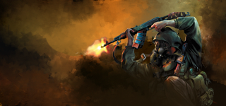
well here is most of my work that i have made in the past 4 months from newest to oldest
GOWNAITOSTYLEcopy.png

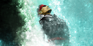
insidiouscopy.png

devildoggsig.png

balloons are made with the pentool
ballonscopy.png

mclovinbattle2copy.png

anarchygiftcopy-1.png

everythin in this is made with pentool
albersgiftcopy.png

treeoflifecopy-1.png
 

XGC Rare FX

New member
The first 3 kindof have the same feal, just a different render (I like them, dont get me wrong)

The MGS one with snake looking like hes in like a waterfall looks pretty cool.

I also LOVE the website layouts you posted in your App, you should throw those up here aswell.

Peace
HoSTiLe
 

Xexxy

New member
very nice
you know your way around ps i can see
you have nice concepts, just not so much on executing them
first one, and all pen tool are my favs
 

Xexxy

New member
lol
my contrast is terrible
i already know that much
but the bad part, is no one ever told me anything about having bad comp up until i started using cs4, where you can see it got better

as for tuts
ive looked at loads of em
and they dont really do anything for me
i know how to do pretty much anything is photoshop
achieve any effect id like
but i dont have an artistic eye at all
so i can never just sit there and figure out what i need to do to make it look good

so yeah, im a person, that has no artistic ability at all
and its a little complicated
but oh well
 

Rampant

New member
what do you meen not so much on executing them? and the first three have the same feel because i used the smudge tool on them a lot
 

Xexxy

New member
well i mean like
i can kinda see what you were trying to do with them
bit it doesnt look like it turned out right for that type of sig
the first one has too much blank space
the second one has nice smudging
but its still too balh, and doesnt exactly fit the render
the third one, once again is blah, all smudge sigs are hard to pull off, and just throwing in a render doenst look all to good
 

Rampant

New member
i would say work a lot more on the contrast in your sigs and work more on blending the effects into your sig they look like they are just kinda thrown in there
 

XGC Rare FX

New member
RECENT WORK

Recent Work

I have a thread open, but figured Ide make a new one.

I Crit everyone else, leme get some feedback this time xP

Sigs - Oldest to Newest -
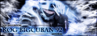
KoGBigCuBaN92copy.png

MySigcopy2.png

alszworldcopy.png

thinblueline621.png

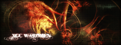
XGCR0ADBL0CK.png

Mysig2copy.png

HoSTiLeFXcopy.png

Viper2copy.png

Mineagaincopy.png

GeneralTagcopy.png


Heres a couple I just redid, I liked them, but I made them a long time ago.
SYNxLightningxcopy2.png

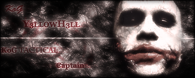
Y3llowH3llcopy3.png

Dragonsigcopy.png

Sasukecopy.png


Banners:

KoGLethalBannercopy.png


SYNPOSSESSEDcopy2.png


Banner2copy.png


KoGHELLHOUSEcopy.png


Peace
HoSTiLe
 

Rampant

New member
see with almost all of these i dont just throw in a render though i actually take the render itself and smudge it like the second one i smudge the render to make it match the person i was smudging but i can see what you meen with the first one has to much empty space
 

XGC Rare FX

New member
As youve prolly seen me do alot, I went ahead and edited one of yours, this could help you or not, this is just my spin on things, and I enjoy doing this more than making sigs myself xP

- My Edit -
Editcopy.png


- Original -
GOWNAITOSTYLEcopy.png


Peace
HoSTiLe
 

Xexxy

New member
i dont really like the one you edited
if i were you rampant i would try some very light smudging and light c4ds for some good efx in the blank spots...
id show you an example but om not on my comp and cant find any atm
 

XGC Rare FX

New member
Yea I didn't realy do much, it was more just brushes than anything, I dont realy work with smudged sigs, so I dont realy know how to go with it.

Peace
HoSTiLe
 

XGC Rare FX

New member
Lol, thats what I used to think to, then I actualy put some time and effort into photoshop.

Then again, you cant even play CoD4 ;)

Peace
HoSTiLe
 
Status
Not open for further replies.
Top