OLD GALLERY PAGES

OLD GALLERY PAGES


  • Total voters
    12
Status
Not open for further replies.

SYN Cheddarbob

New member
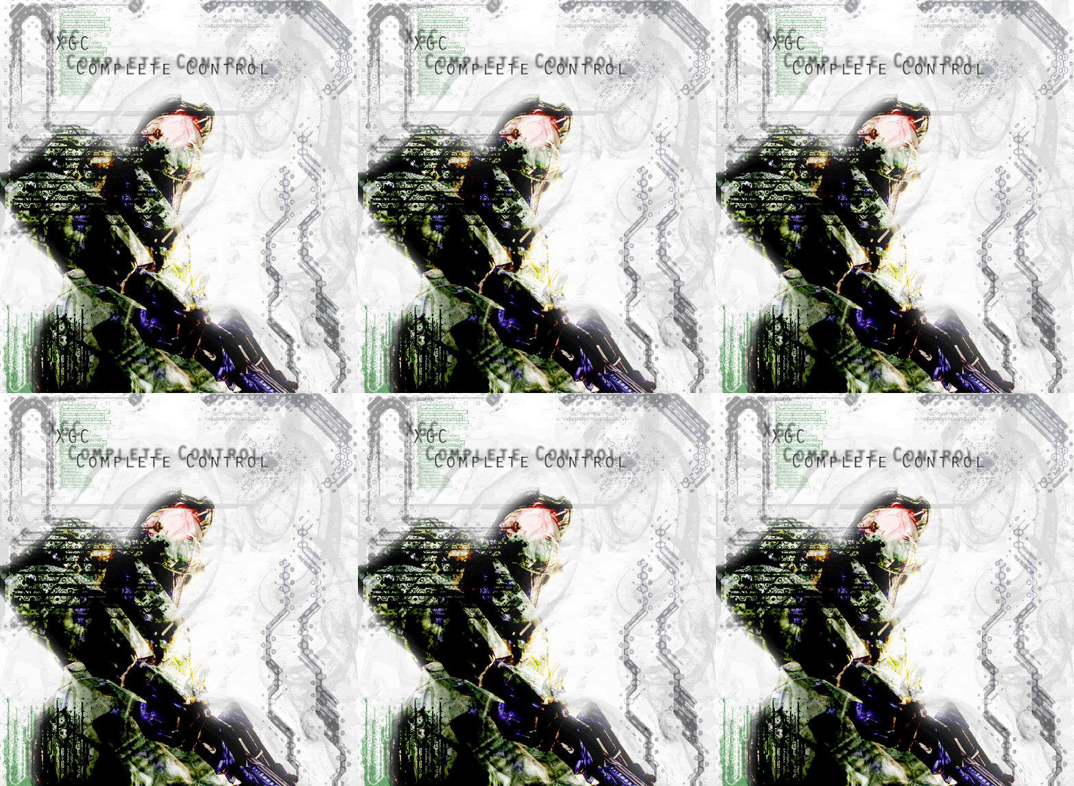
Not sure but I was the one who rendered it though. I got the backround from a friend and used photoshop for the rest. I'm thinking it might have been a screenshot from Dead or Alive 4.
 

Im ProdigY

New member
your sigs like to grab me me but the text just pushes me away then, there's just to much of it...but i like the general effect of it all...good work
 

SYN Cheddarbob

New member
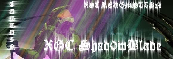
REDEMTION.jpg

here's my latest sig.
 
Aww, well thank you guys for your comments..

In my defense, the "catch me as I fall" lyrics were a request for a desktop. I do tend to use a lot of text. I'm going to see how I do trying not to use any text at all and just focus on the picture.
 

Kila Arose

New member
yay!bc in most sigs or graffiks you wanna
try and make the focal point the image,lets
see some new ones from ya this is a old thread!
c'mon the best way to get better is to get critisism
 

XGC THA BODY

New member
I aggree with kila, needs a focal point, For example the papercut one, that one is great, but slowly got more scattered as they progressed. and tuts, are tutorials, you can learn alot of tools, and practices using them,
http://www.tutorialfx.com <---- thats my favorite one.

also, I am sure that kila, and including myself will love to give you tips, just pm me with a skype or AIm screen name, and I will try to get back with you.
 

XGC THA BODY

New member
Eh I give it a 6.5/10 It is very simple looking which I like. But I never really liked that "X", there is just something about it that pushes me away.
 

XGC THA BODY

New member
That is all it is, redered BG, with layered spartan, and text overlay. if I am wrong sue me, but it is something that could be thrown together in like 5 minutes. And yes you can cut out a figure (spartan) in like 30 seconds, with the find edge lasso.

so as killer would say, I give it a "2"
 

XGC THA BODY

New member
I think they look good but I would put a low opacity layer for a BG.

But other than that they look good. not very original though'
 

XGC THA BODY

New member
Its called brutal honesty, personally I think starting with a white page, throwing a render filter, with a distortion, then putting a cardbord cutout and text, makes a horrible sig. no offense but they are all very poor variations of one sig. Trying using, different brushes, blending, find more filters, and watch your colors, and legible text.

This is my negative reenforcement.
 
Status
Not open for further replies.
Top