georgeholland1
New member
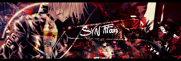
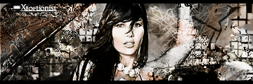
its that right hand side again mate, just arrange the layers so that c4d layer goes under the gradient map, see if that helps, if not mess around with the layer properties until it looks blended in more. the brightness of it is taking away the focus from the render.
i think if you do this then move the text directly down in between the two line emerging from the render just to keep with the flow... also, im not sure if this will look right but try the font called Yellow Magician from dafont.com (when you type it has to be in all capitals) it looks right in my head anyway.
apart from that, yea it is a big improvement.
you have improved the flow from the render, and that circle thing looks in place. i usually dont like circles around the render but it works here.
alot of detail in the background but it doesnt jump out at you which is great.
sorry if this was a chore to read and hope it helps


