XDC Dresden
New member
1) GT and user name
- XGC DresdenDoLL
2) What type of program are you using?
- Gimp mostly. I own CS5 but have very little experience using it.
3) How much experience you have with your program and making sigs?
- I have been designing sigs since July of this year (2012), and have learned a bit from other designers and through tutorials.
4) Do you want to be a freelancer or become full-time?
(Freelancer allows you to stay in your current clan & be part of the design team. If you choose full-time you will be expected to make a divisional transfer to join XDC)
- Freelancer.
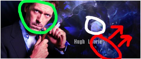
5) Submit as many works that you have done (try at least 5)
1.

2.
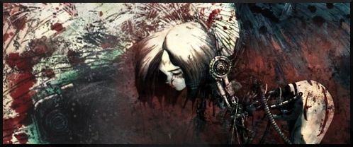
3.

4.
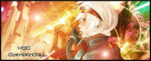
5.

- XGC DresdenDoLL
2) What type of program are you using?
- Gimp mostly. I own CS5 but have very little experience using it.
3) How much experience you have with your program and making sigs?
- I have been designing sigs since July of this year (2012), and have learned a bit from other designers and through tutorials.
4) Do you want to be a freelancer or become full-time?
(Freelancer allows you to stay in your current clan & be part of the design team. If you choose full-time you will be expected to make a divisional transfer to join XDC)
- Freelancer.
5) Submit as many works that you have done (try at least 5)
1.

2.

3.

4.

5.
