- Forums
- XILED TEAMS
- DESIGN & EVENTS TEAMS
- DESIGN TEAM
- STORE EX-DESIGNER MEMBER THREADS (ADMIN ONLY HIDD
You are using an out of date browser. It may not display this or other websites correctly.
You should upgrade or use an alternative browser.
You should upgrade or use an alternative browser.
[ACCEPTED!!!] XGC DRESDENDOLL'S DESIGN APPLICATION
- Thread starter XDC Dresden
- Start date
XDC Dresden
New member
Which one looks like a button? I are confuzzled.
SYN Ichigo
New member

This one looks like a button due to the edges.
XGC Radioactive
New member
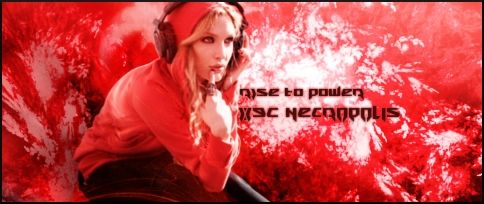
too much red? I'd definitely take off the color on her face.
XDC Dresden
New member
Okay, how about this?


XDC Dresden
New member
This is the one I've spent the past 2 hours playing around with. What do you think?


SYN Ichigo
New member

^^Definitely better. I would try adding a gradient of black/white on luminosity or violet/orange.

^^I like this one. =)
XDC Dresden
New member
SYN Ichigo
New member
I like the way the colors are on these. =)
XDC Dresden
New member
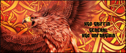
Here's one I just made for XGC Griffin. What do you think?

Last edited:
XGC BIZARRE
New member
I like it...
SYN MsTwiztid
New member
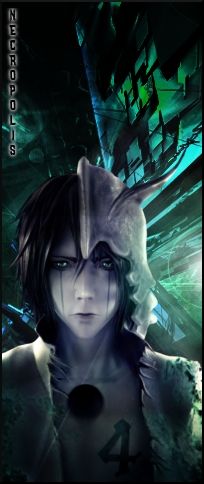
On your vertical, the placement just seems off. It feels like you tried to make a focal for a horizontal tag fit as a vertical and it just isn't work.
SYN Ichigo
New member
Here's one I just made for XGC Griffin. What do you think?

I like it. One thing I've found that you have to watch for when you distort an image is a doubled up effect as I call it not sure of the actual term for it. If you look at his beak it looks like he has another beak showing up behind his actual beak. And you might try a different background this one has the eyes paying more attention to it than the focal. Other than that looks good to me. =)
XGC Radioactive
New member
I like it. One thing I've found that you have to watch for when you distort an image is a doubled up effect as I call it not sure of the actual term for it. If you look at his beak it looks like he has another beak showing up behind his actual beak. And you might try a different background this one has the eyes paying more attention to it than the focal. Other than that looks good to me. =)
I agree about the background. the colors are great, but soften it up a bit. It's too chaotic. I disagree about the beak.
XGC Radioactive
New member
try out different sizes, the 500x200 gets old, and leaves you with a lot of open space. I realize you chose it because the render needed it to look good. that happens
XGC Radioactive
New member
On your vertical, the placement just seems off. It feels like you tried to make a focal for a horizontal tag fit as a vertical and it just isn't work.
kinda said the same thing. the only thing is the image she used cuts him off at that level. I suggested taking another image and cropping the lowe half of the body and pasting it together, and maybe use a brush to cover up the "Scar". I like the look of it though. Maybe just make it a shorter vertical?
XDC Dresden
New member
For Griffin, he specifically asked for Bright red and Celtic knots in the background with a large griffin. It wasn't my favorite thing to do but I tried to make it work the best I could. I'll try and work with it some more.
As for the distorting goes, I didn't distort anything or "double up" anything, so I'm not sure what Ichigo means about the beak.
I'll also try turning my vertical into a horizontal. The focal I used was of him cut off at the waist.
I've just been trying out different things as I haven't been getting any feedback about my other sigs other than from Radio.
XDC Dresden
New member
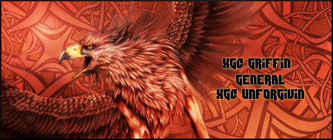
I tweaked the layers a bit and played with the opacity. I don't know. I'm not a huge fan of the background, but tried to make what he wanted all work together and make something decent.

SYN Ichigo
New member
I tweaked the layers a bit and played with the opacity. I don't know. I'm not a huge fan of the background, but tried to make what he wanted all work together and make something decent.

Lol my bad on the beak. It was the background and not the beak that I saw. =) It became more clear after you changed the color on the background. You might try taking the part of the background that has the flow going from top left to bottom right and have it repeat in the background just to give it a little more flow.
SYN MsTwiztid
New member
kinda said the same thing. the only thing is the image she used cuts him off at that level.
I'll also try turning my vertical into a horizontal. The focal I used was of him cut off at the waist.
XDC Ixias said:On your vertical, the placement just seems off. It feels like you tried to make a focal for a horizontal tag fit as a vertical and it just isn't work.
Exactly my point guys! lol, renders that end at the waist should be kept to horizontal signatures. They just work better that way. Jack Skellington is the perfect example of a horizontal sig focal.

