[ACCEPTED!!!] XGC DRESDENDOLL'S DESIGN APPLICATION

SYN MsTwiztid

New member
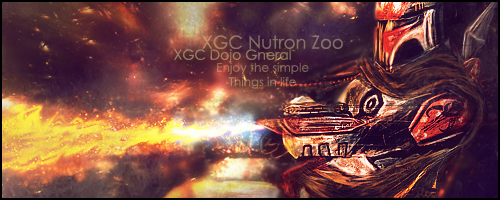
I don't like it. =\ I don't think your effect fits with the render. There's something else that I can't put my finger on. Just not feelin this one, I'm sorry.
 

SYN MsTwiztid

New member
xgcnutronzoo.png

Ok, i'm actually looking at it from my computer now.
first of all, your star stock make your signature look kind of low quality. Also, the light source here would be the flame, particularly the blue part of the flame. I don't understand the whole bright top left. The lighting is just way off.

Also you need to work on depth on this one. Also, just for the sake of the application, go ahead and fix that text up for me. Try finding a color that will work other than black, maybe something that will blend a bit more, maybe ever use a different font.

Also, the coloring is bad. That's probably because of your star stock, but try to use more reds.

Go back and see what you can do to fix some of these things.
 

XDC Dresden

New member
Would you like to show you the original? I'm making sigs for people who ask for these sort of things. Maybe I shouldn't have even bothered to post it on my application.
 

SYN MsTwiztid

New member
No, i don't need to see the original. Just go back and work on the things that i mentioned. I'm glad you put this in your application because now we get to work it out and make it amazing. Right now you're ok. You make signatures and alright. But let's get you to a point where you are amazing.
 

XDC Dresden

New member
I wanted to go ahead and include the original. I'm going to work on making a signature work for this on my application. The person requested this image, so I tried to make it work for him and he's happy with it, but I also want to make it awesome for my application and not just show mediocre sigs.

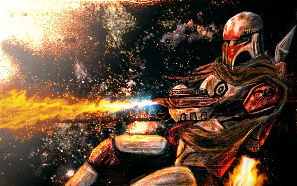
mandalorian_flame_by_rundash-d4rnzdl.jpg
 

SYN MsTwiztid

New member
Ok, one idea for this image would be to blur out the cluttered space background and then use a softer space stock to fill in the space. This also gives you the opportunity to play with blending (Smudging, blurring, erasing, ect,), Lighting and depth (Blurring, sharpening, burning, dodging.)

As a general rule you would want to have your font close to your render, this is something I threw together real quick to give you an idea of the kind of changes you can make on this one to move in the right direction. Of course I don't expect you to do everything I did, because then you'd be copying my work, but try to get a similar result using the knowledge you already have about design.

(I did this one in GIMP, so there shouldn't be anything in here that isn't easily done in GIMP.)


XGC-Nutron-Zoo_zps14d17cae.png
 

XDC Dresden

New member
I would like to learn how you smudged this. I have trouble smudging the backgrounds around my focals. I've been zooming in and doing my own rendering instead, which is very time consuming in Gimp. I had so much trouble with this because every time I tried smudging, I would ruin the flame thrower. Ugh.
 

XDC Dresden

New member
Here's the original that I had to work with:

cosmos_by_RobbyP.jpg


I wanted to get an image that would require blurring so that I could practice what Ixias did with the Mandalorian sig she made.
 

XDC Dresden

New member
I have had such a hard time with this signature. Here's what I currently have.


nutronzooapp.png


Ixias, when you find the time, I would like to see how you created your signature. I've tried blurring and all different things but I can't seem to get rid of that pesky light source in the top left corner.

 

SYN Ichigo

New member
I have had such a hard time with this signature. Here's what I currently have.


nutronzooapp.png


Ixias, when you find the time, I would like to see how you created your signature. I've tried blurring and all different things but I can't seem to get rid of that pesky light source in the top left corner.

Have you tried using the burn tool to darken the light source at the top left corner? And I would move the text either to the left or up a little just enough so that its not over the focal.
 
Top