[ACCEPTED] XGC RADIOACTIVE

Status
Not open for further replies.

XGC Radioactive

New member
biotemp-1.jpg
?

i'm working on it. lol.
 

XDC Jinno

New member
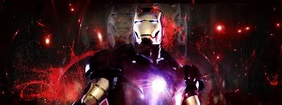
yeah, if they shy away they don't become what their name stands for lol. Kidding aside, a few examples is your big ironman signature the main focal is a bit to the right, you try to put a light on his left hand to make him center of attention, but the first thing I notice is your text. Focals, imo, are the first things you should see in a signature. In that case, try working on flow towards your focal. It should definitely help. even though flow could look subtle in signatures, they still make the focal stand out the most.

 

XGC Radioactive

New member
yeah...I guess i see what you're saying. I downloaded about 25 new fonts, got some really cool ones that'll go great with ideas I have in my head. i'll be pushing out some more images.
 

Jupiter

New member
i do now, it wasnt showing up when i looked last night lol.
& yes the focal is better better on that one.
 

Jupiter

New member
for the atreyu one, try placing a blur and the repeats of the guy so they dont take away any attention from the main 1. the bleach one isnt too bad yet the colors kinda of hurt my eyes >.< & the pop out one i might like more if he was actually popping out of the sig rather than looking like he was just pasted on top of it. what i mean by this is have the bottom of him even with the rest of the sig border on top & all but have him pop out at the top.
 

XGC Radioactive

New member
'tis why I asked for a cnc :p

i'm working on a request right now. I'll post it when I'm done before I present it to him. My first football sig o_O
 
Status
Not open for further replies.
Top