- Forums
- XILED TEAMS
- DESIGN & EVENTS TEAMS
- DESIGN TEAM
- STORE EX-DESIGNER MEMBER THREADS (ADMIN ONLY HIDD
You are using an out of date browser. It may not display this or other websites correctly.
You should upgrade or use an alternative browser.
You should upgrade or use an alternative browser.
[ACCEPTED] XGC RADIOACTIVE
- Thread starter XGC Radioactive
- Start date
- Status
- Not open for further replies.
XGC Radioactive
New member
I'm not a usc fan lol, but oh well.
XGC Radioactive
New member
you know...i think i'd be amazed at what I can produce if I took more than 10 minutes to make a sig....
**okay, maybe 20 minutes to make a sig...
but still, that's not that long.
**okay, maybe 20 minutes to make a sig...
but still, that's not that long.
XGC Radioactive
New member

better?
XGC Radioactive
New member
I do take my time, I just "get in a groove" 
He loved it so I'm happy. That's all my sigs for tonight.
He loved it so I'm happy. That's all my sigs for tonight.
XGC Radioactive
New member
I'm excited about this.
XGC Radioactive
New member

approved by XGC Reborn XK, btw.
XGC Radioactive
New member
well, XGC Zeus, they're still have to vote on it 
XGC BroodDevil
New member
how did you make that animated?
XGC Radioactive
New member
It's kinda hard to explain...
XGC BroodDevil
New member
I figured it out but thanks haha.
XGC Radioactive
New member
Specifically requested by them. I've been getting personal requests out the wazoo....I'm not even advertising that o make sigs
XGC Radioactive
New member
Besides my Sig.
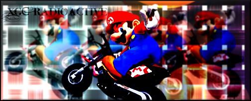
I like the back grounds on a few of your sigs, but one thing that i noticed about them is they are not really balanced you have alot of stuff going on on one side of the sig and the render is not quite in on the action or is a loner outside of it(i could be wrong though). Need to work on blending the render with the background i say this to alot of people, so ill say it again (not to sound rude), try working with your render when you progress it with the background, if you finish the background, then paste the render in and then start working on it, it wont flow well, also if using photoshop try using the gradiant maps, (if you need a explaination on it look up on google or pm me about it) im not sure gimp has it or not, try using diffrent filter, FILTERS= GOOD, lol. i do like the animation you did, i have a nitmation graphic i did years ago, never was my forte, but i agree with the others wait till your accepted to post them, because if its a bad animation it could affect decisions. Alot of your sigs are bright as hell, try toning them down or applying a gradiant map to em. Im not sure how you do your renders but if you only have one render layer try making multiply smuding them adding overlays and screens one on top of another also dont be afraid to use a eraser tool if something doenst look good in blending backgrounds with renders. Hopes this helps if you need anything dont hesitate to ask.
XGC Radioactive
New member
I think I got it...
XGC Radioactive
New member
I will be the first to admit, I had no idea where to begin. I did work however on making the background with the use of the render, as well as merging the render(x10) with a screen or Hard light option.

**and I also figured out that I no longer have to "render" any images you put up that have already been done! I just download as a .xcf and GIMP uploads it with the alpha layer already there. I use to have to go in, add an alpha, then zoom in and "trace" the borders with an eraser

**and I also figured out that I no longer have to "render" any images you put up that have already been done! I just download as a .xcf and GIMP uploads it with the alpha layer already there. I use to have to go in, add an alpha, then zoom in and "trace" the borders with an eraser
XGC Radioactive
New member
- Status
- Not open for further replies.


