You are using an out of date browser. It may not display this or other websites correctly.
You should upgrade or use an alternative browser.
You should upgrade or use an alternative browser.
BANNER REQUESTS ARCHIVE 12/02/11 - 08/04/13
- Thread starter KoG Remix
- Start date
- Status
- Not open for further replies.
XGC BroodDevil
New member
None when my Photoshop crashed it took all my work with it 
XGC BroodDevil
New member
XGC Radioactive
New member
I will take a screen shot and show you. 
XGC BroodDevil
New member
I have sorta figured it out if you see lol still getting used to it hard to tho
XGC Radioactive
New member
Once you get the idea of Gimp, its actually very simple
XGC BroodDevil
New member
Let me give you a tip of advice, Look into blending your render into your background, once you have it blended, then work on your skill with back grounds. One of the key things is not to bring your opacity down on a render to try and blend it usally to blend a render it can take anywhere from 5-20 layers of the same render, if you want a quick fix try and use a blur filter, then put the render over the rendered blur then set it to overlay if gimp has that ability.
The one i like the most is the ichigo one, a simple vector but still needs work. Your backgrounds on your sigs look good but need more depth, more zaz. A lot of it seems like you took a c4d or stock photo and brushed over it, try smudging the stock, then putting a light coating of brushes on with the multiply, overlay, or screen filter.
As for your renders, it seems you just copy pasted the renders in and used the dodge tool and burn tool to try and blend it in, the hulk one you did was good way to try and blend it in, try duplicating the render layer a couple times and smudging it and play with some filters.
A big thing i see with people with graphics is they dont work with the render as they create the background, i use my render to make my backgrounds, start trying to do that and watch your improvement skyrocket, dont just only use one render layer.
We all started off weak at first then got better, good luck keep up the good work and hope to see you on the team sometime
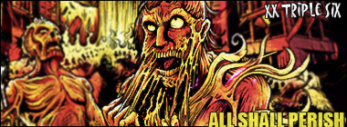
this is my first signature i ever did

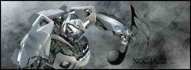
An example of what you told me to do from over a year ago, Background created from the orignal render, not my first rodeo...
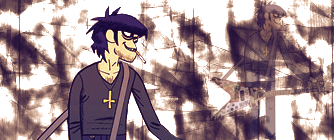
No sign of burn or dodge on any of the blending, I blur and have a tendency to over sharpen in an attempt to bring a texture look to my focal point, I have found more effect ways since then, most of my work is older, some from requests, some from test images, some made in my own free time.

No sign of burn or dodge on any of the blending, I blur and have a tendency to over sharpen in an attempt to bring a texture look to my focal point, I have found more effect ways since then, most of my work is older, some from requests, some from test images, some made in my own free time.
XGC TOMMYGUN XC
Community Leader
If you ever need help with GIMP, let me know!! I don't use it much anymore but I got pretty good at it and still remember how to use it!!
I realize now i sounded rude, feel free to be critical, Just for one to improve it is better to critique and help the applicate to strive to better ones self with helpful advice and comments, I felt like you where more telling me what I am doing wrong, than how to better my work.
Not my intention at all, when i first started my graphics, i was butchered alive when i posted my sigs to get rated on past sites. i got very defensive, i know how it seemed im sorry too if it seemed that way. But after awhile, no matter how harsh the critics were on my work, i eventually liked the ones that were harsh and detailed breakdowns of my sigs and what seemed i was doing, helped me greatly.
with me and im saying this is just me, the more descriptive in what one of my sigs need improvement in and what i can do to better it, the more i can focus in on what im doing wrong then trying to fix something thats already good,
but realize you will never create the best graphic in the world somewhere someplace someone will always tell you where to improve on, or what they saw you did wrong
doesnt mean your work isnt good, just means in this world of graphic makers there is constant improvement and people just get better we all started at the same point lol.
if you need help with anything or a question on how to do something just shoot me a pm, also
try and get the Test app image graphics done im not sure if the new ones are posted yet, but try and get one of em done so we can see your latest work, also ive never heard of pixlr try using GIMP if you havnt or for 50 dollars a year you can have adobe photoshop cs5 extended wich is like a 1000 dollar program
SYN HighLite
New member
Me personally, I would remove the white line that is moving across the frame at the head level of both characters. The white line is the first thing that attracts my eye since is the brightest thing in the picture.
okay any suggestions on how to fill negative space?
Jupiter
New member
I wouldnt mess around with animation too much until youve got a good base for your work.
work on building backgrounds from the render or stock photo, itll use the same colors and texturs so your focal wont look like it was just slapped on there. a lot of the time ill smudge lighty around the edges of my render just so they dont have that sharp line.
work on building backgrounds from the render or stock photo, itll use the same colors and texturs so your focal wont look like it was just slapped on there. a lot of the time ill smudge lighty around the edges of my render just so they dont have that sharp line.
- Status
- Not open for further replies.


