- Forums
- XILED TEAMS
- DESIGN & EVENTS TEAMS
- DESIGN TEAM
- DESIGN TRAINING GROUNDS
- TRAINING GROUNDS HISTORY
You are using an out of date browser. It may not display this or other websites correctly.
You should upgrade or use an alternative browser.
You should upgrade or use an alternative browser.
FINISHED WEEK'S
- Thread starter Snyder GFX
- Start date
^I think he's talking about the teal one.^i didnt notice the other one i like that one but its oversharp after you sharpen drop the opacity the text still looks weird text is a pain lol
Snyder GFX
New member
hey relax if you cant take criticism dont post it im not going to walk you through it do some tutorials with cool text to improve it or just dont use it and i was talking about your other sig being sharp relax your not going to learn this stuff overnight
the new text looks better its a better fit for the tag IMO your going to get alot of criticism like that doing this stuff
the new text looks better its a better fit for the tag IMO your going to get alot of criticism like that doing this stuff
Snyder GFX
New member
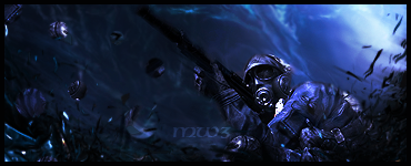
use your imagination to make it look cooler and fit in better here is a few of mine i think i did ok on the text ... help?


Jupiter
New member
i think the glow on the hamsmacker one is too visible.. on the 3rd sig the text draws my eye before the render does.. maybe make it a little smaller? either that maybe move it towards the bottom away from her face. i like the first and second one.. only thing about the second one is the red text is really hard to see compared to the rest of it. this is all just my opinion tho im not super experienced. but atleast i said more than "its weird" 
XDC CHEF ZERO
New member
ZERO-WEEEEKKKKKKSSS #3.
Zero-weeeekkkkkksss #3.

Zero-weeeekkkkkksss #3.

Snyder GFX
New member
good job nice text 
XDC CHEF ZERO
New member
ya lol, it took me a sec, to get it were i wanted it.
KoG Mufasa
New member
great job!!!
XDC CHEF ZERO
New member
Thanks guys, I feel I get better each tag.
xxThanatosx89
New member
My thing has no blending tools does hump have that
KoG Mufasa
New member
things like soft erasers and brushes and c4ds, etc. are what you would use for blending.
KoG Mufasa
New member
needs effects
KoG Mufasa
New member
nice job, effect are awesome, KIU!

