- Forums
- XILED TEAMS
- DESIGN & EVENTS TEAMS
- DESIGN TEAM
- DESIGN TRAINING GROUNDS
- TRAINING GROUNDS HISTORY
You are using an out of date browser. It may not display this or other websites correctly.
You should upgrade or use an alternative browser.
You should upgrade or use an alternative browser.
FINISHED WEEK'S
- Thread starter Snyder GFX
- Start date
Snyder GFX
New member
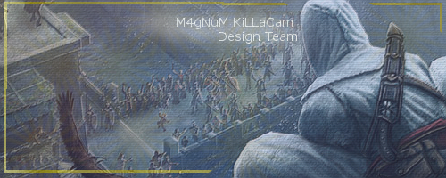
work on blending your render adding c4ds and effects in front and over your render
nice signatures man. the colors are great. and just skim through a bunch of signature tutorials in deviantart.com , pick up ideas/replicate other peoples signatures if it helps. since you got the basics down lean how to use a lightsouce, flow, colors, c4d, etc. again nice improvement
XDC KiLLaCam
New member
Thanks you guys
XDC KiLLaCam
New member

haha new look i wanted to try out wat do you think
XDC KiLLaCam
New member
i added some star things in the background if you look close and added that shutter look. but i appreciate the critisism  makes me better and better
Snyder GFX
New member
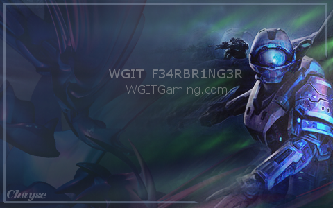
it looks like you have a pattern over it try and keep the main focal clean also work on depth blur it up then erase where you dont want it so blurry to create the depth
XDC KiLLaCam
New member

it doesnt have alot of effects but i made it for my friend and this is what he wanted so idk lol
XDC KiLLaCam
New member

i really like this one wat about you guys
KoG Mufasa
New member
border = no... put your focal closer to the middle (rule of thirds) colors arent bad but needs more effects. kiu
Jupiter
New member
yeah try to avoid putting your render or text in corners.. follow the rule of thirds..here.. http://en.wikipedia.org/wiki/Rule_of_thirds read up on that for info on how to follow that. also.. did you erase whatever was around your render? if so then it neds some touching up theres some spots arounds him that you missed nice job on the colors though


