You are using an out of date browser. It may not display this or other websites correctly.
You should upgrade or use an alternative browser.
You should upgrade or use an alternative browser.
OLD GALLERY PAGES
- Thread starter sturmklient
- Start date
- Status
- Not open for further replies.
NecroWhuut
New member
light source needs to be a little to the right!
NecroWhuut
New member
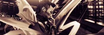
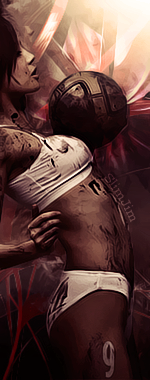
your signature streches the page ur only allowed one vert and nothing else in your sig, but now for the sig i like it, you won your first battle with it xP
NecroWhuut
New member
I already said i would battle you
here i make the rules!
No Vert.
max size 400x150
theme: ummmm freestyle i guess, unless you can think of a theme.
no animation
due tuesday
here i make the rules!
No Vert.
max size 400x150
theme: ummmm freestyle i guess, unless you can think of a theme.
no animation
due tuesday
NecroWhuut
New member
U still suck xp
SYN Cheddarbob
New member
You're not allowed to have verts in your signature.
NecroWhuut
New member
hmmmmmmmmmmmm.... I like the flow, and the B&W looks okay, considering ima n00b you'll probably get better C&C's off of guild inn xP
NecroWhuut
New member
I heard somewhere that, that is all you can have if you want one. but idk 4 sure Cheddars word has better sources.
MasterLeaf
New member
NEED HELP REVERSE-ENGINEERING THIS SIG STYLE
Need help reverse-engineering this sig style
So, I've been making some explosion-flow sigs (using static renders in the center, making the flow towards the center) using this style recently

I fancy making a black version of this sig. Unfortunately the reason the modes Screen and Lighten and Color Dodge work so well is that they don't appear at all on a white Background, so the C4ds and stocks I use only appear in the center. So I figure, the obvious way to go is Linear Burn and its associated blending modes. Boy, was I wrong.
How would you guys say I go about making a black version of my sigs? Like this, for example:

----------------
Now playing: Incubus - Aqueous Transmission
via FoxyTunes
Need help reverse-engineering this sig style
So, I've been making some explosion-flow sigs (using static renders in the center, making the flow towards the center) using this style recently

I fancy making a black version of this sig. Unfortunately the reason the modes Screen and Lighten and Color Dodge work so well is that they don't appear at all on a white Background, so the C4ds and stocks I use only appear in the center. So I figure, the obvious way to go is Linear Burn and its associated blending modes. Boy, was I wrong.
How would you guys say I go about making a black version of my sigs? Like this, for example:

----------------
Now playing: Incubus - Aqueous Transmission
via FoxyTunes
NecroWhuut
New member
Depends on your taste really, maybe a black soft brush xP i have no idea...
MasterLeaf
New member
personally, i dont like this style.
theres no real flow or compo to it.
i mean, the efxs nice, but too much neg space
just doesnt look riteee.
It's the best style I've found to compliment a bland, static render.
And black neg space is a lot better than white, hence my cry for help.
what about using smudge settings....to blend outward. or maybe using a pattern overlay on the outskirts of the "explosion" to create the fade effect you've got going on in the first sig. (which btw is my personal fav thus far). and maybe instead of using linear burn you could try leaving the render as is and reducing the "fill" to where you like it.
also what helps with dark sigs is using a gradient map after applying the image. a good one to use for dark sigs besides the black and white gradient map is the purple to orange gradient map...setting it to either normal with reduced opacity or setting it to "overlay" and adjusting the fill.
hope that helps. =)
MasterLeaf
New member
The center is smudged, it's multiple smudged layers merged together, then the c4d's are adjusted for the space. I'll see what pattern overlays can accomplish.
Also, that's an interesting thing I've always wanted to ask, what's the difference between fill and opacity?
Also, that's an interesting thing I've always wanted to ask, what's the difference between fill and opacity?
Mister Rinzler
New member

see he's my husband
no i'm not your husband... i belong to senorita... sorry
- Status
- Not open for further replies.


