OLD GALLERY PAGES

OLD GALLERY PAGES


  • Total voters
    12
Status
Not open for further replies.

XGC Chocobo

New member
Yeah, you need to make that stand out more somehow. Try this: Make the text white, the glow black, and change the glow's blending mode to multiply or normal.
 

SYN Jerriel

New member
ok ill see what i can do

here is Bunite's sig that i made

bunitecopy-2.jpg
 
H

HvK Fatality HV

Guest
i dont think anything is wrong with it. Its readable just fine the way it is.

I Like Bunites Sig!!
 
Do you guys seriously not see the "X" in Cheddar's first one. But you know what be sick nasty? Cheddar should start one and then send it though all of the designers and they put their own touch on it a see what it ends up like.
 
H

HvK Fatality HV

Guest
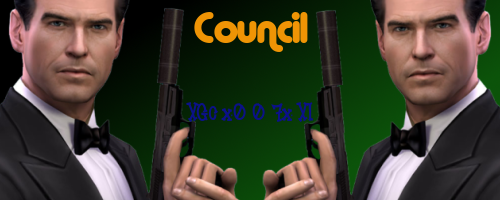
lol i remember a sig i made for 007... haha wow.

007xisig2.png


roflmao

soo horrible. haha (mine is)
 

L4BYRN7H

New member
Yeh that is a good idea.... Nice thinking!i! bbut they need to do a awesome job and it must'nt turn out to be a disaster...lol

lets see what they can come up with...
 
Ya man. Like Chocobo said, look to blur and put edges. I am horrid at sigs, but all of the Design Team seems to blur and border. Very nice work though, thirty times better than my best.

Also, try doing some stuff with Halo, COD people just so you can do whatever people like.

 
Status
Not open for further replies.
Top