- Forums
- XILED TEAMS
- DESIGN & EVENTS TEAMS
- DESIGN TEAM
- STORE EX-DESIGNER MEMBER THREADS (ADMIN ONLY HIDD
You are using an out of date browser. It may not display this or other websites correctly.
You should upgrade or use an alternative browser.
You should upgrade or use an alternative browser.
XGC SINCITY APPLICATION
- Thread starter XGC SinCity
- Start date
XGC SinCity
New member
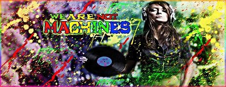
to much going on on TOP of the render, you dont want to do too much(if any) effects over the render otherwise it blurs/blends in with the rest and you want it to be your focal point. The rest of it awesome.
TheRealMrNUGGET
New member
i actually really like the amount of effect you put over your render because the focus on her face gets intensified. the flow with some lines going vertical and some horizontal is a little strange though. splattering is a lot like lighting in my opinion. you need to have a source for all the splatters and have them move from that spot.
XGC SinCity
New member
XGC SinCity
New member
XGC SinCity
New member
XGC Bradshaw90
New member
Dude thats kool...I like that!
DEATHSTR0K3 187
New member
Wow theses sig are incredible. Absolutely amazing you guys got real skill. Im always hovering these forums checking out your guys sig there so cool. Real talent. I was actually looking to get a sig if anyone here can help me or point me in the right direction that be great. I got ideas, I no I should post in the thread requeat sig. I read the before you post thread and it says I need to have 50 posts before I can get a sig or I can ask someone on the side. I dont have 50 yet but im working on it nd I will. So if someone can get back to me I'd really appreciate it.
Thank you
Thank you
XGC Bradshaw90
New member
Wow theses sig are incredible. Absolutely amazing you guys got real skill. Im always hovering these forums checking out your guys sig there so cool. Real talent. I was actually looking to get a sig if anyone here can help me or point me in the right direction that be great. I got ideas, I no I should post in the thread requeat sig. I read the before you post thread and it says I need to have 50 posts before I can get a sig or I can ask someone on the side. I dont have 50 yet but im working on it nd I will. So if someone can get back to me I'd really appreciate it.
Thank you
This is for the application only...please do not post in this thread again. PM me and let me know what you would like or go to the following link and request it from anither designer...OR just post more stuff, really not that hard
http://www.xiledgaming.com/forumdisplay.php?48-Xiled-Designers-Forums
TheRealMrNUGGET
New member
Wow theses sig are incredible. Absolutely amazing you guys got real skill. Im always hovering these forums checking out your guys sig there so cool. Real talent. I was actually looking to get a sig if anyone here can help me or point me in the right direction that be great. I got ideas, I no I should post in the thread requeat sig. I read the before you post thread and it says I need to have 50 posts before I can get a sig or I can ask someone on the side. I dont have 50 yet but im working on it nd I will. So if someone can get back to me I'd really appreciate it.
Thank you
Hop into my forums under the xiled designers and find the forum for sig requests and I'll make it for you.
TheRealMrNUGGET
New member
XGC SinCity
New member
Dude thats kool...I like that!
Thanks I appreciate it! I was nervous about posting it cause I didn't feel really confident about it but I'm glad I got another opinion on it
LOOK AT THE FLOOOOOOOOOOOOOW!!!!! GREAT change with the splatter, all going in the same general direction, much improved. not to mention I like this image ALOT. unique and good work.
Last edited:
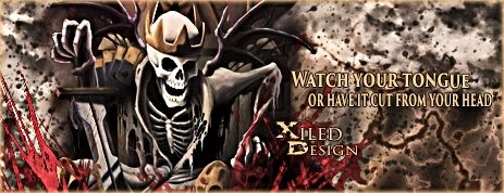
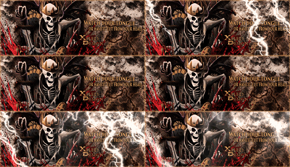
First time animation... riiiiiiiiiight.... very nice.
XGC SinCity
New member
First time animation... riiiiiiiiiight.... very nice.
Lol I'm serious, I watched the rain tutorial that Jupiter posted in the resources forum and just ran with it. It was a really well done tutorial
VenerealMonkey
New member
Hello Syn, I'm VenerealMonkey, Lead Designer over XG Design. I've been busy with other projects and haven't had a chance to pop in and see your work until now.
Before saying anything about your works, I am very blunt and to the point. I don't do it to be mean, but if there is a pile of **** on the ground, well there is a pile of **** on the ground. I call it like it is because people need truth to become better and push themselves.
That being said, here we go....
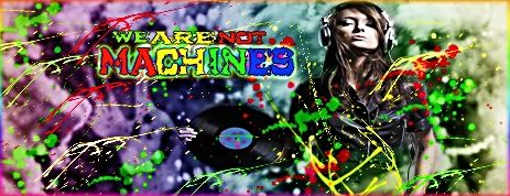
We tend to try and pull colors off the focal to create the background and as a central point of all colors around it. and going all street graffiti over it distorts the entire thing. I'm not saying that skittles splatters can't ever be used, but its very rarely. The render itself is blended and blurred in weird spots. her hand, headphones and cord are all sharp, but then her arms, the record and her shoulders are overblurred.
I can see the effect you were trying to go for, and I know the potential for you to do better is there, just look at your animated sig. nice work on that one.
Now had you done a gradient black and white splatter and put it to overlay, or mess with the layer options as you like, it would bring forward the colors from the background instead of adding an entire color wheel that doesn't fit. Try applying this and repost the new one and then move on to the below.
I am going to give you a link to a render and a tutorial I would like you to use for you next design. remember, this sort of thing is not learned overnight and takes practice and persistence. So bear with myself and the rest of the team helping you through this and you will be well on your way as a Design Team member in no time.
Tutorial: http://www.youtube.com/watch?v=usp5tP1uYgA
Render: http://fc09.deviantart.net/fs70/i/2012/020/4/c/anime_render_1_by_darkneji12-d4mzxxg.png
Before saying anything about your works, I am very blunt and to the point. I don't do it to be mean, but if there is a pile of **** on the ground, well there is a pile of **** on the ground. I call it like it is because people need truth to become better and push themselves.
That being said, here we go....

We tend to try and pull colors off the focal to create the background and as a central point of all colors around it. and going all street graffiti over it distorts the entire thing. I'm not saying that skittles splatters can't ever be used, but its very rarely. The render itself is blended and blurred in weird spots. her hand, headphones and cord are all sharp, but then her arms, the record and her shoulders are overblurred.
I can see the effect you were trying to go for, and I know the potential for you to do better is there, just look at your animated sig. nice work on that one.
Now had you done a gradient black and white splatter and put it to overlay, or mess with the layer options as you like, it would bring forward the colors from the background instead of adding an entire color wheel that doesn't fit. Try applying this and repost the new one and then move on to the below.
I am going to give you a link to a render and a tutorial I would like you to use for you next design. remember, this sort of thing is not learned overnight and takes practice and persistence. So bear with myself and the rest of the team helping you through this and you will be well on your way as a Design Team member in no time.
Tutorial: http://www.youtube.com/watch?v=usp5tP1uYgA
Render: http://fc09.deviantart.net/fs70/i/2012/020/4/c/anime_render_1_by_darkneji12-d4mzxxg.png
Last edited:
XGC SinCity
New member
Hello Syn, I'm VenerealMonkey, Lead Designer over XG Design. I've been busy with other projects and haven't had a chance to pop in and see your work until now.
Before saying anything about your works, I am very blunt and to the point. I don't do it to be mean, but if there is a pile of **** on the ground, well there is a pile of **** on the ground. I call it like it is because people need truth to become better and push themselves.
That being said, here we go....

We tend to try and pull colors off the focal to create the background and as a central point of all colors around it. and going all street graffiti over it distorts the entire thing. I'm not saying that skittles splatters can't ever be used, but its very rarely. The render itself is blended and blurred in weird spots. her hand, headphones and cord are all sharp, but then her arms, the record and her shoulders are overblurred.
I can see the effect you were trying to go for, and I know the potential for you to do better is there, just look at your animated sig. nice work on that one.
Now had you done a gradient black and white splatter and put it to overlay, or mess with the layer options as you like, it would bring forward the colors from the background instead of adding an entire color wheel that doesn't fit. Try applying this and repost the new one and then move on to the below.
I am going to give you a link to a render and a tutorial I would like you to use for you next design. remember, this sort of thing is not learned overnight and takes practice and persistence. So bear with myself and the rest of the team helping you through this and you will be well on your way as a Design Team member in no time.
Tutorial: http://www.youtube.com/watch?v=usp5tP1uYgA
Render: http://fc09.deviantart.net/fs70/i/2012/020/4/c/anime_render_1_by_darkneji12-d4mzxxg.png

XGC SinCity
New member
Hello Syn, I'm VenerealMonkey, Lead Designer over XG Design. I've been busy with other projects and haven't had a chance to pop in and see your work until now.
Before saying anything about your works, I am very blunt and to the point. I don't do it to be mean, but if there is a pile of **** on the ground, well there is a pile of **** on the ground. I call it like it is because people need truth to become better and push themselves.
That being said, here we go....

We tend to try and pull colors off the focal to create the background and as a central point of all colors around it. and going all street graffiti over it distorts the entire thing. I'm not saying that skittles splatters can't ever be used, but its very rarely. The render itself is blended and blurred in weird spots. her hand, headphones and cord are all sharp, but then her arms, the record and her shoulders are overblurred.
I can see the effect you were trying to go for, and I know the potential for you to do better is there, just look at your animated sig. nice work on that one.
Now had you done a gradient black and white splatter and put it to overlay, or mess with the layer options as you like, it would bring forward the colors from the background instead of adding an entire color wheel that doesn't fit. Try applying this and repost the new one and then move on to the below.
I am going to give you a link to a render and a tutorial I would like you to use for you next design. remember, this sort of thing is not learned overnight and takes practice and persistence. So bear with myself and the rest of the team helping you through this and you will be well on your way as a Design Team member in no time.
Tutorial: http://www.youtube.com/watch?v=usp5tP1uYgA
Render: http://fc09.deviantart.net/fs70/i/2012/020/4/c/anime_render_1_by_darkneji12-d4mzxxg.png
I dont have sound on the computer at work so I just did the best that I could with what I could see

Last edited:

