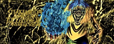
This should be the final product of all your signatures, NOT the yellow eye sore below. I am not even going to go into tearing apart that one because I would be here for an hour. That, and you finally produced a nice signature

After viewing the PSD here are my thoughts and pointers. This is a nice signature overall and would be gladly worn by any member of XG. Improvements, whiteness, effects and font. I am reposting what I adjusted it to as a compare and contrast.
-you put a final vibrance layer over everything and it gave this a fogness to it. lower the opacity of that layer to 53%
- the 3 blue bubble layers - its nice to sometimes add an outside color, but its not always necessary. what I did was b/w each layer and set them either to screen or linear dodge. this way you still get the effect and distinction, but incorporate the colors already there. fast key to do b/w a layer, ctrl+shift+u. I also removed 5 of the layer maps you had to cut down the brightness alittle.
-font, I suggest downloading as many PS styles as you can and use them on your font layers. there are many different effects these can add to dull lettering.
-try not to have both font lines the same size. If you look at most of the signatures myself and the rest of the designers make, the member name is larger and should be in front of the clan/squad/rank lines
This may have seemed like a lot, but they are mostly tips, not putdowns.
