[ACCEPTED!!!] XGC DRAGON SKIN'S APPLICATION

IXssl

New member
Me personally I would tell them to pick on or the other and then explain. Like I had one member want a dogs head with glowing eyes then have like 3 dogs jumping over the head with glowing eyes with something else. But I told him straight up I couldn't do all that, it would take away the flow of the signature. I even told them to go to a designer to make it but they changed what they wanted. And it actually came out better than what he wanted. But I would actually let them know to change what they want if its too much or makes no sense with the flow (in my opinion) but thats just me.
 

SYN MsTwiztid

New member
Hey Dragon! Just stopping by to see how you were doing.

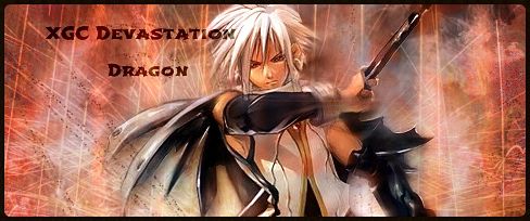
It looks like during the time that you were inactive from your application, you took a couple of steps backwards. That's ok though! We all do it when we go for periods without designing and it takes a little bit of practice to get back into the FULL swing of things.

That being said, your terminator signature looks GREAT! The only bit of criticism I have for you is to remember your Rule-of-Thirds. Most of your signatures use this concept, but this one didn't and I personally feel like it would be better if you for that particular signature.

The only other thing I might consider is fading the white brushes a little bit. I can see where you took the opacity down a little already, i would take it down a bit more, or put the layer on overlay.

Still, excellent work overall!

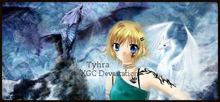
I just want to remind you to try to keep your focal clear of effects. It's best to keep a crisp, clean feel to your focals in signatures. Sometimes there is room to add effects to non-crucial parts of your focal, but try to keep crucial aspects clear.


tyhra2_zps3fd846c8.jpeg

With this signature, you have two focals. You want to try to stay clear of that. It just makes everything too busy and really makes the eye go crazy trying to take in all of the information.

I also really don't like the fact that you put the text on your focal. You want your text to hug your focal, but you have your text extended onto her neck/shoulders.

I would suggest doing an edit on this one.


106d14ac-c438-4614-ac45-706f54ac731f_zps719e45e1.jpg

Once again, you have your text on your focal here. This one is a little trickier due to the fact that your focal takes up most of the signature.

You should make your focal smaller. She looks kind of odd right now. She has no chin or neck. Also if you were to make the focal smaller and reposition it, then you would have a much better place to put your text.

You blended the girls hair in with the background, but you didn't blend the dragon.

I understand this was a request, but for applications sake, i would suggest re-working this piece.
 

XGC Dragon Skin

New member
I agree with everything you said Ixias. Certain aspects and rules of thumb were forgotten over time. I have tried to follow everything all of you have told me to the fullest of my abilities at this point. Thank you for taking the time to write a huge explanation for the required changes it does help a lot.

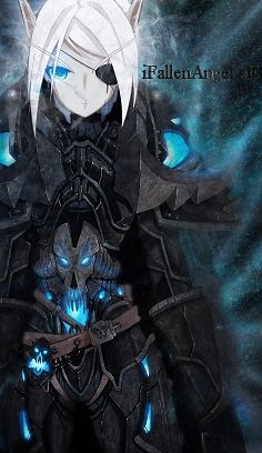
The FallenAngel sig isn't being used and will not be used in the future. She told me that the sig didn't represent her well and was too girly. I can still fix It if you like but that is the story behind that one.


Last edited:

VenerealMonkey

New member
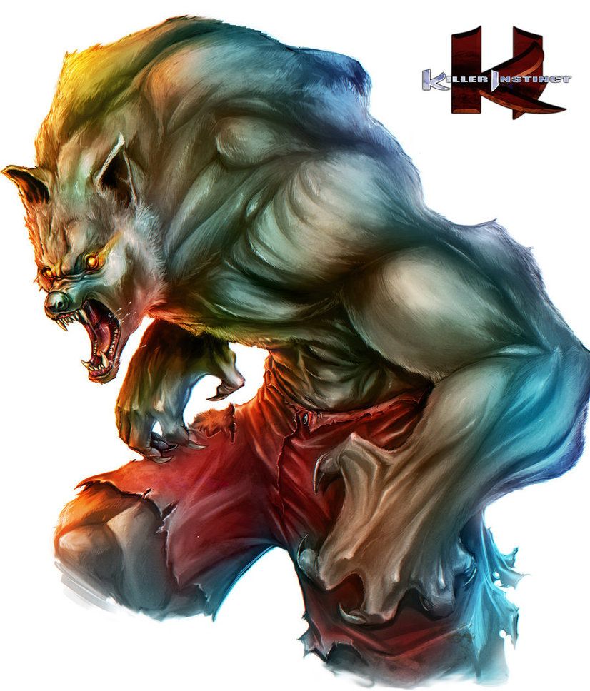
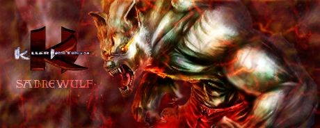
not too bad dragon. I would work on your blurring a little bit. if you look around his right hand and the bicep on his left arm. if you crop out a picture or over sharpen the edges, take out your blur tool and go over the over sharpened areas. also on this one, blurring around the pants and abs would give it a little more depth.

I am not a big fan of the background color mixed with the white. if you took a gray/blue or gray/orange, it would have flowed a lot better.

To back up what Ixias said, try not to cover your focal too much with other images. I have done it before, but only very lightly around the edges. if you want to add texture to a bland render, find a sand, dirt or stone stock, overlay it on top of the focal, and erase everything else around the focal. but use this ONLY if necessary to made your focal better. I think this one could have done without the red on top of it.

I would like to see you take my suggestions and retry this image. I see the potential there for you to make this a nice sig for your app and yourself -V
 

VenerealMonkey

New member
a little better. take the red veiny overlay completely out of there and change the background as well to one of my earlier suggestions. also, a little less blur around the hand. it looks like you smudged it instead of blurring it. make sure you are keeping at least the last two versions of a test image incase you over do something and want to go back a few step.
 

XGC Radioactive

New member


Let me know want to get these perfect.

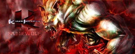
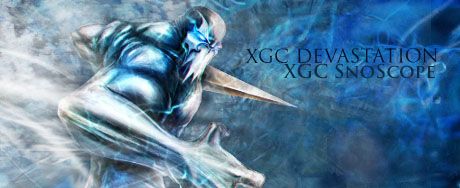
I really like what you did here. I agree that you should maybe soften some of the effects on the focal, I usually try to only allow one or two lines to overlap. I do like the white and the red background choice, The colors pull from the focal. I don't like the doubled effect you did, and it does need to be a little more sharp. A great tool I've learned to do to make more depth is to get a good image going, and BEFORE c4ds, duplicate it, take the top layer and do a gaussian blur at about 35-45, and do like an overlay or similar effect, and erase over the actual focal. It'll help with blending as well. there is also a hard line under the text logo you did that bugs me. I'd make the text image a little transparent, too. Don't let it take away from the main piece.

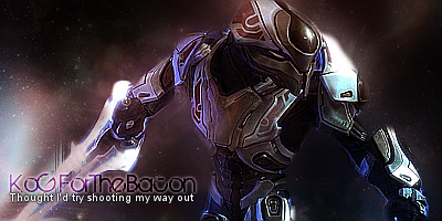
that effect can be seen in this sig here.

kogforthebacon_zps3a0a82d0.png


I'm glad to see you still have the talent you left with.
 

XGC Dragon Skin

New member


The character had a black line boarder around it making it difficult to blend. Any quick fixes or is the only thing to spend time erasing. My other thought was to add a black shadow. Is there any other way than that?
 
Last edited:
Top