[ACCEPTED!!!] XGC DRAGON SKIN'S APPLICATION

XGC Radioactive

New member
Ah, you mean the render itself has an outline. Okay I see. smudging around him, maybe even try that gaussian blur trick. Other than that, not much but to just erase it.
 

XGC Dragon Skin

New member
Yeah I can take another swing at the background, I was following Dresdendoll's Tut and was trying to match what she was doing. Thank you for taking the time Radio, have it fixed and back up in a little while.
 

SYN MsTwiztid

New member

This looks good. I'm loving this, excellent work!


This...not so much.

I'm going to be honest with you Dragon. I see some of your work and I'm like, "WHOA! This guy is spot on! Let's accept him!!" And then I see other signatures and I'm just like, "What went wrong?! The last one was so amazing Q.Q"

You have a lot of potential. I can see it in about 40% of your designs. The other 60% are lacking. So let's see what we can do to get that 40% up to 100%!

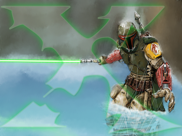
On the first signature, you have great flow, lighting, depth, blending and coloring. I'm loving it. It's fun, you have effects throughout the whole design and I don't think that they're too distracting. It's just great! The only thing i'd say needs improving is the text. But text is very difficult to get a grasp on. I even still struggle with text. >.< You also have a great use of your Rule-of-Thirds. I have absolutely no CnC for that signature.

Then I look at the 2nd signature...
There is no blending at all.
There is no flow
There is no depth
The colors are off. Your render is green, you background is like the crayon box puked on it. =(
There is no lighting
The effects are poor quality as is the background.

Just overall a bad design.

I think you need a different approach with this stock image.


I think that the background is giving you a bad start, so let's soften it to give you a good starting place. You can do this from smudge, blurring, cloning or a mixture of all three. I personally like blurring, but we can do it with smudging as well. For a blur, i would take the stock, duplicate it to a new layer and apply a Gaussian blur. Then i would take my soft brush and with an opacity of about 45 and erase over the focal a few time until i got a soft background, but my focal was clear.

But for this image, since the rain is a really had white, a blur wont work very well. This will require some smudging.

Here is what I came up with.

smudging.png


Now, I only took the lines out of the top of the focal. You'll have to spend a little more time working it out.

You'll also notice that I put the X over the image. This is because I don't want to do the work for you, i want to teach you so you're better equipped to work with images like these in the future. =)

If you find yourself just absolutely struggling with getting a good base from this image, then let me know and if i can't assist you any further, than i'll take the watermark off and let you use this for your signature. But I have faith that you can do it!


A 3rd option would be to render the focal completely, but i think this smudging will be efficient.
 

XGC Dragon Skin

New member
Thank you for the feedback and I have mentioned before I think very abstract when I approach some images. The image I wanted to portray is him approaching through the water in a very heavy storm to assassinate one of the Jedi's. I will for sure do this one over for the Nutron Zoo's sake, I sometimes don't realize how unappealing abstract is for some people.
 

SYN MsTwiztid

New member
I'm not talking about the style your used. You can do abstract all you want! But that image was missing all of the basic design elements that we've been teaching you since day 1. I'm implore you to do abstract work! But keep your Depth, Lighting, Flow, Coloring, Blending, Text and Rule-of-Thirds in mind when you are doing your abstract pieces.

My CnC had nothing to do with your style and everything to do with those elements.
 

SYN MsTwiztid

New member
Hey Dragon!

XDC Rave XS & I were discussing your application. After a lengthy conversation, we would like to see some more consistency from you. We really loved the yellow signature from you this week, but the star wars one is like 5 steps backwards.

If you can show us some consistency, then we would love to have you on the team!

Please take the next week to produce 3-5 top notch signatures for us and we'll let you know what's going on next week. =)
 

XGC Dragon Skin

New member
Ixias, Those are my three sigs, Take me or lose me, LOL. I know I still have room to grow, but seriously thank you for taking the time to help me out.

Let me know where we go from here...
 

Rave

New member
Three was the minimum silly. :p

For the second signature, place the text next each other and move the focal out of the center. I like the top one the most out of the three most recent signatures. I just noticed in the third signature that the text is a little hard to read. Maybe sharpen the text a little bit?
 

XGC Dragon Skin

New member


Ok, so I can solve this once and for all. I thought the rule of thirds was just that your action areas were in the six spots outside of the center. When I read it awhile ago, I didn't see anything that said your central image couldn't be in the center. Don't take this as arguing, this is a friendly conversation...​
 
Last edited:

SYN MsTwiztid

New member
lol, so let's clear it up. =)


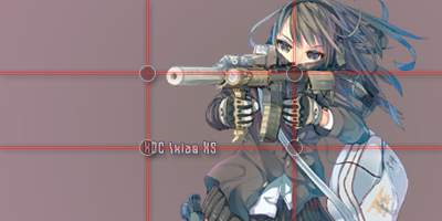
The Rule of Thirds suggests that an image should be imagined as if it were divided into nine equal parts by two equally-spaced horizontal lines and two equally-spaced vertical lines, and that important compositional elements should be placed along these lines or their intersections.

Here's an example:

rule-of-thirds-1.png


My focal is lined up on the right vertical line. And the gun she is holding is set along the top horiztonal line. Also, my text is placed on the bottom horizontal line and starts where the bottom and the left line intersect.

My text is also close to my focal. This creates kind of a bridge from the text to the focal. It's easy for the eye to read the text and then just glide right on over to rest. We read left to right, so that's the effect I've set up in this one.

Now, this isn't a complete signature. This is just a render and some text, but you get the idea of placement from it.


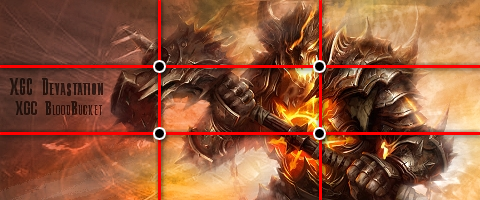
With your image, the Rule of Thirds would be placed like this:

rule-of-thirds-dragon.png


Pretty good job if you ask me! The only thing i would suggest is possibly moving it to the right just a little bit more so that the top right intersection is where his face is.

But the text is really far away, and it kind of sticks out like a sore thumb.

Try choosing a color from the render and background that will still let the text stand out without throwing off the entire thing.

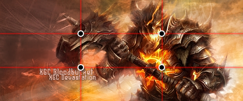
Try something like this:
rule-of-thirds-dragon2.png


This way, your text is right below your bottom gridline and it's still close to the focal. Also, since i used a color from the signature, it blends in and doesn't stand out too much. The right side is a lot lighter and the right side is a lot darker, so i chose a color from the right side since i was placing the text on the left.


Does this help you at all Dragon?
 
Top