- Forums
- XILED TEAMS
- DESIGN & EVENTS TEAMS
- DESIGN TEAM
- STORE EX-DESIGNER MEMBER THREADS (ADMIN ONLY HIDD
You are using an out of date browser. It may not display this or other websites correctly.
You should upgrade or use an alternative browser.
You should upgrade or use an alternative browser.
[ACCEPTED!!!] XGC DRAGON SKIN'S APPLICATION
- Thread starter XGC Dragon Skin
- Start date
XGC Dragon Skin
New member
XGC Dragon Skin
New member
Rave
New member
I like your edited version of the girl with the dragon much more! I think the one major aspect that it's missing is a light source. You see how the right hand side of her face (left side of the sig) is lighter? That's the side in which you want to add your light source to. There are a few ways to make a light source. What you could try is taking a soft brush and set the size to maybe 30ish, with a low opacity. Than go from the top left corner down towards the bottom right hand corner a little bit. With the opacity low, it shouldn't stand out too much but it will add a light source to balance out the signature.
XGC Dragon Skin
New member
I see what you are saying I had actually tried to drop a shadow behind the image. With the original picture having so many angles it was hard to create a light direction. I'll give it a whirl.


The first I darkened it. The second I lightened it like you said. All I can say is the stock sig is complex because of the shark behind her. It adds another dimension to the picture that makes it difficult. I had fun with it though.


The first I darkened it. The second I lightened it like you said. All I can say is the stock sig is complex because of the shark behind her. It adds another dimension to the picture that makes it difficult. I had fun with it though.
Last edited:
XGC Dragon Skin
New member
XGC TOMMYGUN XC
Community Leader
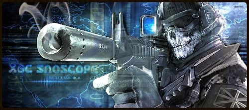
well for 1 its just a hair over sized. Max size on the website is 500 X 200 your is 500 X 221 so it will need to be resized before this person can use it or it could end up as a warning on that person, so you have to be very careful and aware of the rules and guild lines if you are going to make stuff for other people........you could end up getting them a warning or infraction!!
Number 2 the water mark on the hand of Ghost!!!!!!! We should not be using ANYTHING with a watermark.....People put watermarks on Images for a reason, cause they dont want it to be used without permission!! If you need an image rendered (cut out) and you dont know how to do that, you can ask one of the designers including myself!!
So now you know and please lets not let these happen again!!
Other than that its not a bad sig....could use a little more flow and blending!!
XGC Dragon Skin
New member
XGC Dragon Skin
New member
I just finished requesting permission to use the image from the designer on deviantart. Hopefully I get it and then the image will be a legitimate image. I can then rework the sig with the new image. Again sorry for my use the water sealed image without proper author consent.
Last edited:
XGC TOMMYGUN XC
Community Leader
Its all good, no need to apoligize!! The important thing is now you know and your doing the right thing!! Thank you!!
XGC Dragon Skin
New member
XGC Dragon Skin
New member
XGC Dragon Skin
New member
VenerealMonkey
New member
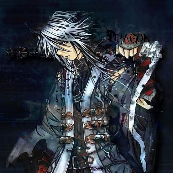
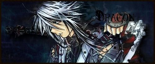
very nice dragon. a few minor things though. for the text, try and lower the opacity to around 80% just to make it flow with the rest of the sig a little bit. also, it looks like you took the focal and slapped it on the background. if you blur the edges a little bit, it would help a lot. other than that, good job, I love the bulged border over the focal too
XGC Dragon Skin
New member
XGC Dragon Skin
New member
XGC Dragon Skin
New member
Rave
New member
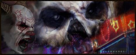
1) I kind of see what you were going with on this one but at the same time i don't. Generally you don't want more than 1 focal in your signature. The reason for this is because human eyes like to soak in details and with two or more focals, our eyes will get confused at what to look at. With one focal, you can have to background lead the viewers eyes to the focal.
2) That aside, this one is kind of messy. I can't really tell what's going on except for two clown heads that are floating. Maybe try cleaning it up and use the sharpen tool to help distinguish objects in the signature.
(Hopefully I'm not sounding like a jerk here, if I am I do apologize).
2) That aside, this one is kind of messy. I can't really tell what's going on except for two clown heads that are floating. Maybe try cleaning it up and use the sharpen tool to help distinguish objects in the signature.
(Hopefully I'm not sounding like a jerk here, if I am I do apologize).
XGC Dragon Skin
New member
I know but he loves it! LOL, So on a serious note what are you supposed to do if someone requests a sig be made a certain way. But that way isn't how you normally make sig's. He asked for all three things.

