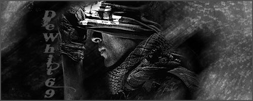
[APPROVED!] XGC JUST DO IT DESIGN APPLICATION

Status
Not open for further replies.

XGC DeWhit69

New member
Hey Radio what happens if you closed it and it grouped it as one layer meow... nevermind I screwed it up I saved it as a jpeg file
 

Jupiter

New member
http://www.sigtutorials.com/tutorials/basics

Try some of these tutorials out.. They're good for beginners & help with the basic elements of making a signature.

As for your current work.. The focals look way out of place, the backgrounds are harsh colors and draw away from the focal, your text is barely noticeable and nothing blends well.

For your focals, help them blend by very lightly smudging the harsh edges of your renders until it looks as though they're part of the scene instead of just placed in on top of everything. You want to have elements that tie them in and you can achieve this by using smudging, overlapping, blurring, etc..

For your backgrounds, you need to pull colors from your render in order to have them work well together. For example, placing tweety bird in a war zone will look like crap 99.9% of the time. Placing a bright render on a dark background will look awful and vice versa. Try to make everything all one big picture even though you're more than likely to use about 20 different images to create it.

For your text, draw a color from your current signature whether it be the render, background, whatever. Try to avoid placing text on the focal as it will draw the attention away most of the time. Keep your text close to your render but try not to overlap. Also, use text to fill in any empty space you may have It will help balance your signature.

Try those tutorials, read up on placement, blending, etc, and good luck :)
 

XGC DeWhit69

New member
Okay let me try it this way and thank Browncoat that imageshack I found out was a trail thing.

SelfTraining_zps87230507.jpg
 

Rave

New member
I hope no-one minds if I post here...
Regarding, on to the last signature that you made, there are a few things that you're going to want to work on with it.

1) Change the direction of the text. It is taking the viewers eyes away from the focal and placing them on the text. You want the text to either be seen as a quick glance, or use the text to bring the viewer to the focal.

2) The focal needs to be moved more to the right. Since they are facing the left, they need more room to look in that direction. Also, you want to follow the rule-of-thirds that is commonly used in photography.

3) You have a good amount of black which is a good thing, but it is very dominate in the signature. You should get some white in there to create a balance between light and dark.

Hopefully I'm not coming off as someone pretentious, I'm simply just trying to help by giving my opinion on edits that can be made to make the signature better than what it currently is.
 

Jupiter

New member
I suggest uploading via photobucket. Once uploaded there, copy & paste the image code here. That way, we dont have to open up attachments :) Makes everything easier.

Has Radioactive posted any new training grounds images lately? I would suggest working on some of those as well :)
 

Jupiter

New member
Your focal has been taken over by the background. This is a huge no-no. :( You want your focal to stand out, but blend in around the edges so it doesnt look like he was pasted on. Another thing, I would have personally gone with a background color that mostly dominated my focal. In your case, it would be white. I'd love for you to try again using this tutorial -- http://www.deviantart.com/art/Cloud-Signature-Tutorial-255022468

I would suggest using red instead of blue towards the end :)
Post your result :)
 

Jupiter

New member
I have no problem with it being your own ;)
Everyone is entitled to make what they feel like. Designing sigs & banners just have certain standards as far as flow, color, lighting, etc.. go. I hope you dont feel like im grilling you about your work. In all honesty im just trying to help.
 

XGC DeWhit69

New member
LOL im in the military so ive been grilled before and I have thick skin so naw your not offending me lol. I gotcha on the standards just when it comes to lighting im not that great as I am with dark colors, so the lighting thing is a good thing for me I just cant seem to make it come out like I want it. anyhow ive been doing a lot of sigs for my clan you should check some of them out:

http://www.xiledgaming.com/album.php?albumid=5636

and thanks for not getting fusturated with me either.
 

Jupiter

New member
I have posted new images in the "Test Images". Please create 2 signatures or banners using these images :) I will be posting images weekly for you to work with. The more active you keep your app, the more we can help you to increase your skills and get you in the direction of being accepted to the team. If you have any questions please ask :)
 
Status
Not open for further replies.
Top