- Forums
- XILED TEAMS
- DESIGN & EVENTS TEAMS
- DESIGN TEAM
- STORE EX-DESIGNER MEMBER THREADS (ADMIN ONLY HIDD
You are using an out of date browser. It may not display this or other websites correctly.
You should upgrade or use an alternative browser.
You should upgrade or use an alternative browser.
[APPROVED!] XGC JUST DO IT DESIGN APPLICATION
- Thread starter XGC DeWhit69
- Start date
- Status
- Not open for further replies.
Jupiter
New member
Alright lets see..
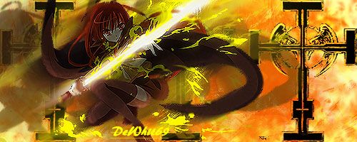
Color -- The colors are way off. Usually you want to pull colors from your focal point, in this case your render. With her, you would want to use reds, yellows, oranges, & blacks. This is important because when you have too many colors that don't match at all, your eyes start looking everywhere instead of just the focal.
Depth -- The background should be slightly blurred and your render should be slightly sharpened. This helps bring your view directly to the focal.
Placement -- Normally try to avoid placing your focal directly in the center of the canvas. Using "The Rule of Thirds" is much more appealing to the eye naturally. Here is a link to see what that is -- http://en.wikipedia.org/wiki/Rule_of_thirds
Also, your effects don't really flow well with the render. Normally, try to look at your render or stock photo and see what theyre doing or what is going on. In this case, shes got a sword with some flame type effects coming off of it, right? You would then choose effects that kind of match that such as flames, sparks, light strokes, etc.
XGC DeWhit69
New member
Jupiter
New member
The colors are definitely better, yes!
The placement of your focal is much better as well.
You seem to have a lot of darkness going on with your render while your background is extremely light however. This pulls away the focus from your render.
Here is a sig I did with this character, actually --
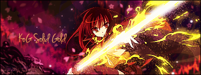
It was from a long time ago and not everything on it is correct but hopefully you can see what im talking about.
The placement of your focal is much better as well.
You seem to have a lot of darkness going on with your render while your background is extremely light however. This pulls away the focus from your render.
Here is a sig I did with this character, actually --

It was from a long time ago and not everything on it is correct but hopefully you can see what im talking about.
XGC DeWhit69
New member
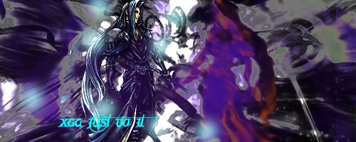
yeah I like the magma spark look, I really didn't think to use purple in the background. lol I just couldn't figure out what to do with it lol.
XGC DeWhit69
New member
I tried that too but I couldn't find one that looked right to me.
XGC DeWhit69
New member
XGC DeWhit69
New member
XGC DeWhit69
New member
XGC DeWhit69
New member
Jupiter
New member
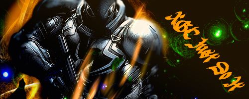
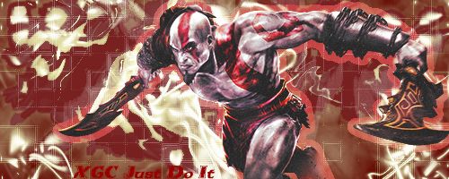
On your spirit blast one I like it. I do feel there is a lot of empty space which can be easily fixed with a smaller canvas. For that focal, I would go with a 400x200 canvas. Im not too sure I like the font choice, its a bit too detailed & it takes away from the focal. Overall though I think you did a nice job.
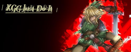
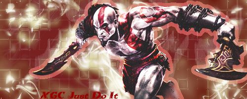
For the next one, I would suggest going with a gray & red based color for the background to help your focal blend better. I do however like the font & color choice but would make it a tad bit smaller. I think you're improving however Keep it up!
For the next one, I would suggest going with a gray & red based color for the background to help your focal blend better. I do however like the font & color choice but would make it a tad bit smaller. I think you're improving however
XGC DeWhit69
New member
XGC DeWhit69
New member
IXssl
New member
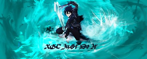
Very nice with the flow definitely need to blur him better so it looks more natural with the picture. First i make about 4 copies of him (ctrl + j) then with 4 out of the 5 i go to filter gaussian blur and set all of them to 5.0 now after if you want to mess with the filter effects that's on you but after Usually what i do is take the blur tool and put the circle just small enough to blur the edges of the focal, then i set the opacity down to about 10 or 15% and start blurring around the edges. Once I'm down blurring i switch to the sharpen tool and start sharpening it alil but (also make sure the opacity for the brush is low you don't want to over sharpen it) i hope this was helpful. Oh and also with your text it's waaaay too blended in i would either put a drop shadow or a slight stroke on it but all in all very good job
XGC DeWhit69
New member
XGC DeWhit69
New member
- Status
- Not open for further replies.


