You are using an out of date browser. It may not display this or other websites correctly.
You should upgrade or use an alternative browser.
You should upgrade or use an alternative browser.
OLD GALLERY PAGES
- Thread starter sturmklient
- Start date
- Status
- Not open for further replies.
WorldsOnlyHope
New member
Really can you give me an example of one that you think looks really obvious?
And sadly, for all of these, I was only able to use Adobe Elements 5.0. Yep oldschool! LOL I don't even have CS2 anymore....sad times. But I got to make with what I got.
Thanks for stopping by.
And sadly, for all of these, I was only able to use Adobe Elements 5.0. Yep oldschool! LOL I don't even have CS2 anymore....sad times. But I got to make with what I got.
Thanks for stopping by.
maybe its not that it is stretched to far, it might be that you are enlarging it so much because the render looks like it is really low quality...if you have a render that starts off small dont enlarge it too much because it will start to look kind of weird like this one

Scoggerbot
New member
Good job with the wallpaper Tidal. The only thing I would sugest is use something less drull for the backround. Maybe an explosion or a scenery? But I do love the concept of a Spartan carrying an Elite. Very nice.
Also good work on your sigs.
Thanks, I appreciate it. I'm still learning and creating a graphical background on any scale (especially a large one like a wallpaper) presents quite a challenge for me.
Deadly Pandaman
New member
That is pretty B.A. That would be an awesome Banner!!! 10/10 
Deadly Pandaman
New member
MY SECOND TRY AT A SIG.
My second try at a sig.
This is my second attempt at making sigs if you would i would really like for you guys to give some good criticism so i can become a better sig. maker and if you think of anything that would make it better plz post it.

This is 1.2 of that sig. I used "The King and Queen" font and the Lucida Calligraphy like you suggested Chocobo. Aan i also put a border around it like you guys suggested. I also tried blending in the render a little more so here is the new one.

My second try at a sig.
This is my second attempt at making sigs if you would i would really like for you guys to give some good criticism so i can become a better sig. maker and if you think of anything that would make it better plz post it.

This is 1.2 of that sig. I used "The King and Queen" font and the Lucida Calligraphy like you suggested Chocobo. Aan i also put a border around it like you guys suggested. I also tried blending in the render a little more so here is the new one.

Last edited:
XGC Chocobo
New member
Well, in this case it works out really well actually, but you've done very little if any blending of the render INTO the background. Try adding layers with blurs and different blending modes on top of renders to make them "fit" the background better.
Also, pet peeve of mine, the FONT. College profs allow Arial, Veranda, and Times New Roman only for a REASON. Well, two reasons actually *cough*, but one of the reasons is that they're clean and easy to read. Almost ALWAYS use a simple font so it's easy to read, I typically only use fancy ones as the first letters in the word or here and there randomly. For a sig like this, I would probably use "The King & Queen" font as the first letters and then use Lucida Calligraphy, which has a cursive/itallic flare to it but is yet read easily enough.
Also, almost ALWAYS use black, white, or transparent text in your images as opposed to colored, and try to use only one color per sig.
Last thing based of this piece, there's no border. Play with beveling and embossing and/or using the rectangle and oval selection tools to give your images a more polished edge.
WorldsOnlyHope
New member
maybe its not that it is stretched to far, it might be that you are enlarging it so much because the render looks like it is really low quality...if you have a render that starts off small dont enlarge it too much because it will start to look kind of weird like this one

Yeah, sadly the render was very low quality...
Maybe I should just avoid those kind of images. Thanks
WorldsOnlyHope
New member
oh and another cool thing you do, with the WH set it to overlay so that you can barely see it...it will look so much cooler...i do the same thing in my sigs, if you go look at my album in the design forum on my last three sigs i have hidden messages
LOL Nice, I'll take a look at that. You should probably put a link to your album on your signature so that it would be more accessible to viewers.
So, what you want me to do is play with the opacity of the text?
MY WORK
My work
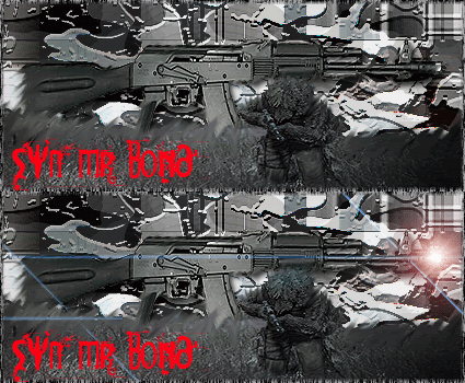
Ok, so this is mainly my newer stuff. I just recently started using realism stocks and im getting pretty good with em. Still need a little practice though. Feel free to comment any of my work, and suggestions are greatly appreciated.
Also, i use Adobe Photoshop CS2.
My work
Ok, so this is mainly my newer stuff. I just recently started using realism stocks and im getting pretty good with em. Still need a little practice though. Feel free to comment any of my work, and suggestions are greatly appreciated.
Also, i use Adobe Photoshop CS2.
Stocks
Real People


Stocks
Random







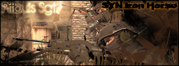


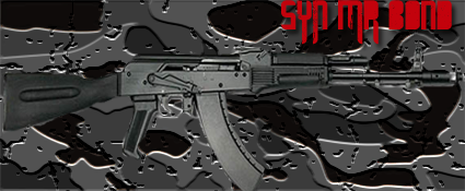
Renders
Gaming Renders


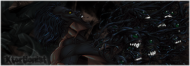


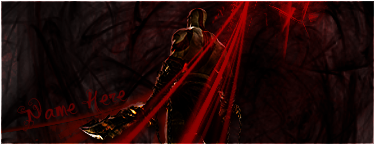


Renders
Random Renders


Banners


Animation


Real People


Stocks
Random


Renders
Gaming Renders


Renders
Random Renders


Banners


Animation


Last edited:
SYN Cheddarbob
New member
New Sigs!


Last edited:
SYN Cheddarbob
New member
Thanks, it took hours to get right lol
- Status
- Not open for further replies.
