[ACCEPTED!!!] XGC DRAGON SKIN'S APPLICATION

XGC Dragon Skin

New member
I knew you were going to ask that. I should have though of that. Think I would learn by now!

zombie4_zps1dbd30f1.jpg


zombie4_zps15cff242.jpg


zombie10_zpscc4276f3.jpg


cemetary_zps878ca720.jpg


zombieart_zps7000dd6f.jpg


ZOMBIES11_zps744bd32a.jpg


zombie9_zpsb7ffdc02.jpg


Untitled_zps2f0cce4b.jpg


zombie8_zps25e1ae47.jpg


zombie8_zpse6fe6202.jpg


zombieart2_zps414370e6.jpg


Untitled_zps5a4536b7.png


I know not much has been done as far as designing anything. I was focused with learning the different text features and the photo re sizing tools available. I am still watching the first video of tutorials and I am trying the different methods out.
 

xxThanatosx89

New member
right now if recommend focusing on designing we don't call it A text app
Doesn't take much to slap text and rezize and crop
Well text Cnc text should be visible but not distracting it should also be discreet and blend with the image also avoid placing it in corners
 

XGC Dragon Skin

New member
I have a family with a two year old and a pregnant wife. I work and go to school full time. I really understand what you are saying i simply don't have time to accomplish it. I am still very new to all of this designing stuff and don't have the knowledge base to create anything outside of what you have already seen.
 

XGC Radioactive

New member
We will come back to the koi in a little. I posted some challenging test images. They offer a great array of techniques to follow. I would like to see what your thoughts are. Remember to keep a color and texture flow going. You want the focal to be a focal, but to "belong" with the image you are creating. Remember, designing isn't taking an image and adding text, It's taking something and molding it into YOUR image. Be proud of what you create.
 

Rave

New member
Well I'm inactive and all but I'll give you some tips.
1) From what I have seen so far you are placing 2 already pre made images together and maybe slightly blurring them. See 4.
2) When working with text, keep the text together and not on the focal or in corners. For now I wouldn't add text into your signatures until you gain a better grasp of designing.
3) I would recommend reading/watching tutorials to get more familiar with the functions of the program since you said yourself you are just beginning.
4) I like your concepts but you need to add more effects to them like star stocks, C4D's, bubbles, lighting, etc... I'm sure if you ask any of these designers that they'll be more then happy to point you in the right direction when it comes to finding materials for your work.

Hopefully I'm not coming off as a jerk or what have you, but I just want to help others learn and become the best that they can be. If you need any help and I'm on the site just let me know and I'll try to help you.

Here's a few GIMP tuts for you.

http://gimper.net/viewtopic.php?f=35&t=8510

http://gmc-aniki.deviantart.com/art/Crysis-SIg-01-GIMP-Tutorial-156945787

http://fc07.deviantart.net/fs16/f/2007/124/4/2/C4D_Signature_Tutorial_by_Jadchor.png
 

XGC Dragon Skin

New member
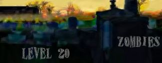
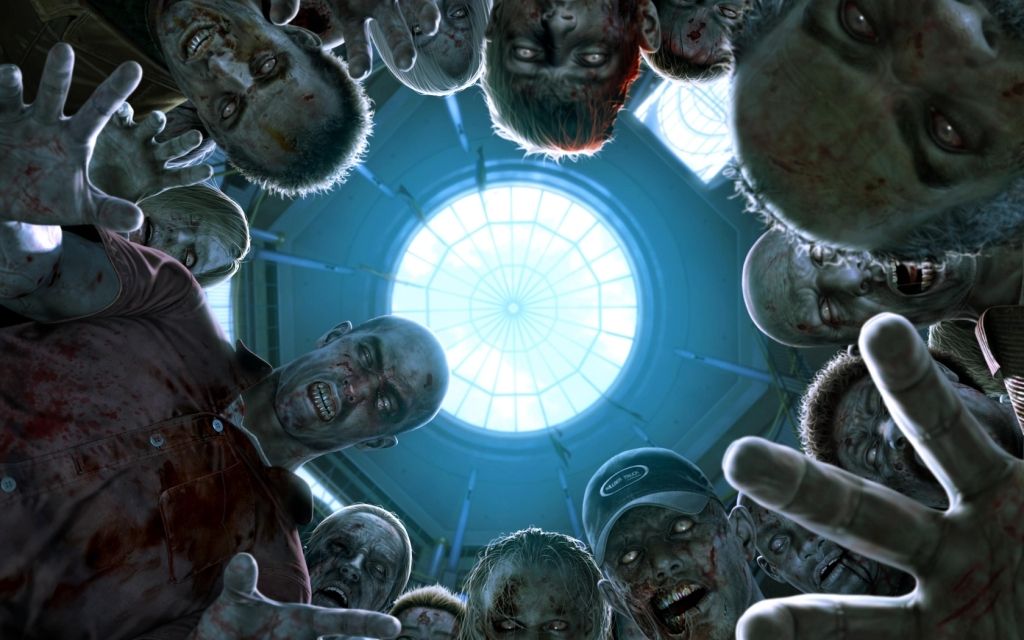
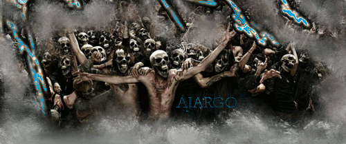
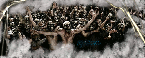
The zombie one above. I cut the image out put it on a black back ground and then cut out the arms and placed on background. Super sized the airbrush tool and put the red blood look into the back ground.
 

Rave

New member
I wasn't directly pointing out that signature. Looking at your other work, it seems like there is little to no direct changes done to them besides text. All I'm trying to do is help you succeed in your app.
 

SYN MsTwiztid

New member
Dragon, I strongly suggest following the tutorials that Rave posted for you. They will definitely help progress your application along. Also, please remember that we are all designers, we can tell what your doing with the images, no need to explain, we are just helping you take your current signatures to the next level.

When a designer gives you advice, it is best to follow it. Pake the nessecary to your signature and post it back up. It shows us that you are serious about you application and are willing to work with us.

If you dont mind, please pick one of the 3 tutorials posted by Rave and follow it. When your done, let us see the results. =)
 

SYN MsTwiztid

New member

Now we're talking!

This is wonderful progress Dragon. Great work!!! Keep it up!

The blue on this is a little off-putting. Try going back and changing that. Id suggest picking a color from your stock image. Since you dont really have much to choose from, the color of their skin would most likely be the best way to go on this one.
 

SYN MsTwiztid

New member
Much better.

Next i'm going to suggest that you read over this post from GIMPTalk.com. The author goes into different aspects of signatures such as flow, depth, lighting and color. These are all things that we are looking for from all of our applicants and designers.

This isn't so much a tutorial, but more of a set of guidelines that all of your signatures should follow.

=)
 

XGC Radioactive

New member
Hey Dragon,

I've been assigned as your mentor to help you along especially. This grants me the ability to specifically focus on YOUR work, not others in such detail.
 
Top