[ACCEPTED!!!] XGC DRAGON SKIN'S APPLICATION

XGC Dragon Skin

New member
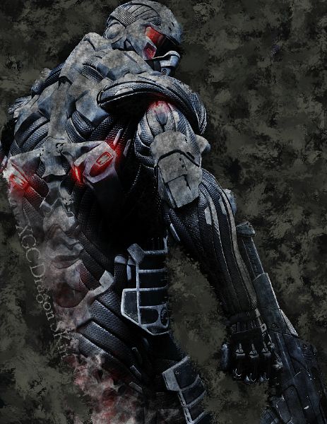
soldier2-1.jpeg

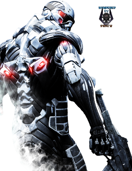
render9.png


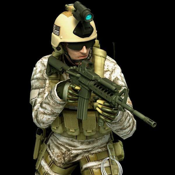
SOLDIER-1.jpeg
 
Last edited:

Inked Ivy

New member
You need to work on text placement. Generally diagonally spaced text is a no-no. Also in both sigs 2 & 3 its too hard to see against the grunge styled background.
Clean horizontal text close to the focal is always good to fall back on. Often simple is better, especially if there is quite a lot happening in the background.
 

XGC Dragon Skin

New member
The overall flow of the background just wasn't coming to me at all. That sig was played around with quite a few times and I just never got it to where it had good flow.
 

XGC TOMMYGUN XC

Community Leader
I agree with Ivy....especially in text, simple is always better...That the #1 mistake of most designers, including me at the beginning, alot of people like to over due text. You definitely want to keep it small, simple and barely noticeable, you dont want it to take away from the focal!!
 
Top