[ACCEPTED!!!] XGC DRESDENDOLL'S DESIGN APPLICATION

XDC Dresden

New member
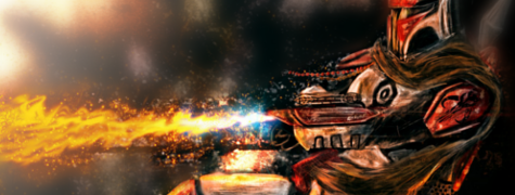
I'm experimenting with different effects with the angel sig. It's a work in progress. Here's one I just made for XGC Hulk.


XGCHulk_zps8c3d7c40.png
 

Jupiter

New member
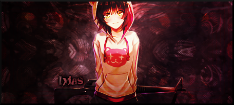
Text is tricky. I usually pull a color that blends well with the sig. I would choose a dark green and put a drop shadow on it in yours.. and normally i make the name larger and the clan & rank and what not smaller, like so...sometimes it helps to use two different fonts, but simple ones, nothing too extravagant.


XGCHarliequinn.png


a lot of times with the darker backgrounds ill make the text white and set it to overlay, like above ^^
 

SYN MsTwiztid

New member
Ok Dresden. This is basically what i started with. I sized and placed my image, then I duplicated it, added a Gaussian blur of around 30-40, and then I erased over the focal. This is how i started my image. Hopefully this will help. No smudging required ^.^


Untitled_zps1f7751ba.png
 
Last edited:

SYN MsTwiztid

New member
Alright. What about this? I also added the splatters.


XGCHulk-1_zps1de525f7.png

I think this is great. I like the direction you're going with this. The only thing about it is the right side of him isn't very blended, so he looks a little odd. Maybe try blending him in on the right side a little more. Great Lighting, Coloring and Effects though.

And the text just works a lot better. Great work.
 

SYN MsTwiztid

New member
Oh snap! I'm liking that one. Usually you want to stick to the rule of thirds, but i'm actually digging the placement here. Great work.
 

Jupiter

New member
I like that you lightened the background to match the render but now it looks a bit too over saturated. instead of lighting up the entire background, try adding in some simple light effects such as optical flares or some subtle light sources.
 
Top